Clarity you can trust
Reality-proof capacity management and project planning, powered by accurate time tracking loved by over a million users
Sign up for free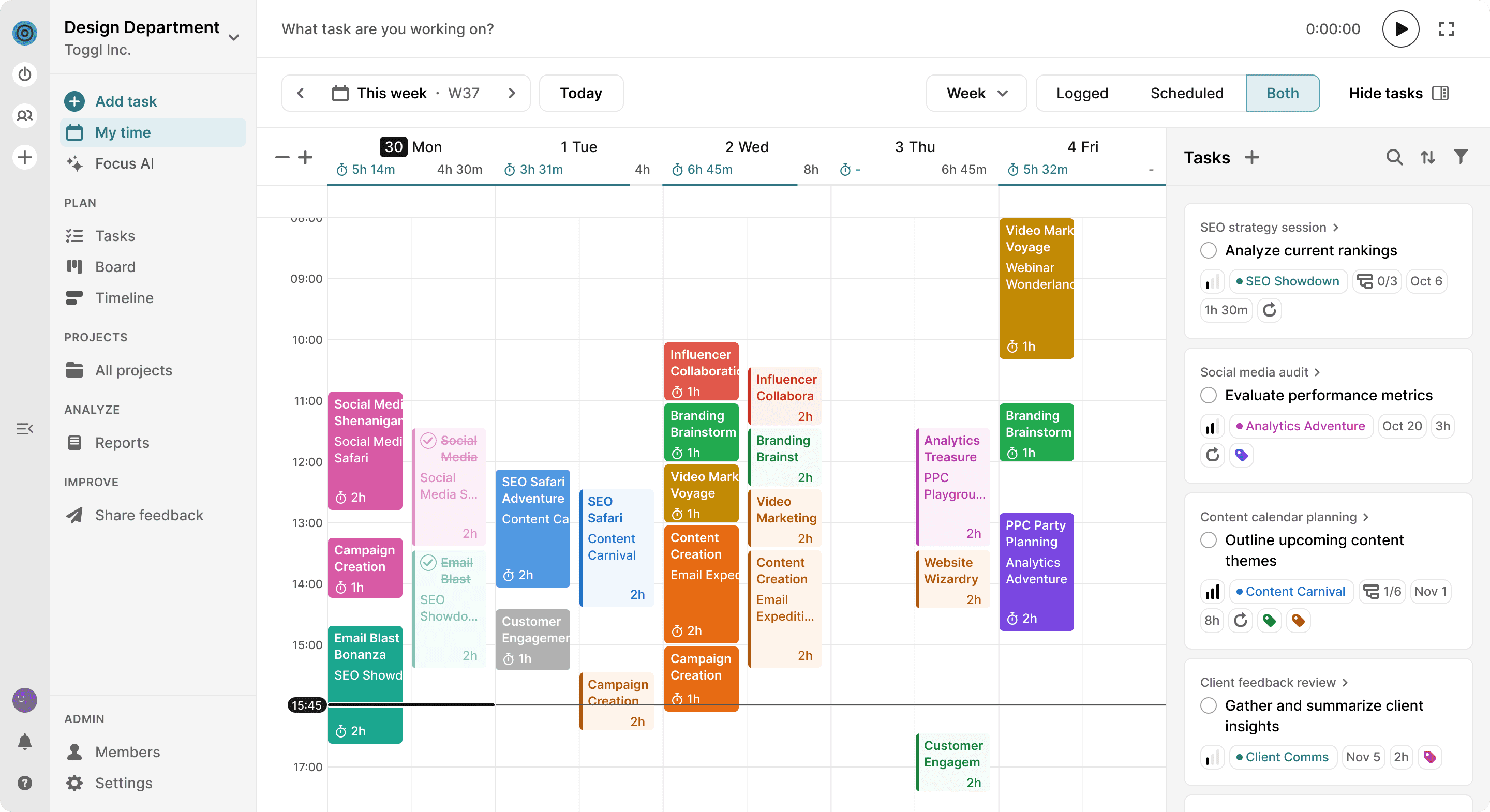


How often do your plans turn out to be just… guesses?
You’ve tried the tools. You’ve done the communications.
Yet, it’s still happening:


Toggl Focus changes that.
We’ve helped millions love time tracking.

Now we’re using that trusted foundation to fix broken planning. Other tools treat time tracking as an afterthought. We built everything around it.
Great time tracking that powers great planning that powers you
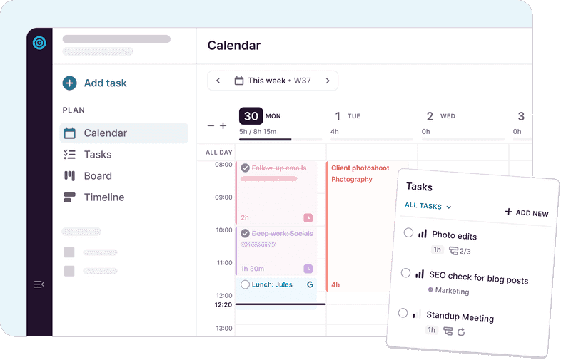
Clarity on what’s today and what’s next
No more scattered to-dos — just a clear place for everything that needs your attention.
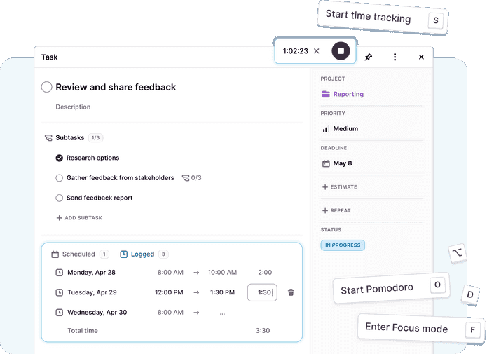
Plans connected to your reality
Blend planning and time tracking so you know how long work really takes — and planning for the future gets more accurate.

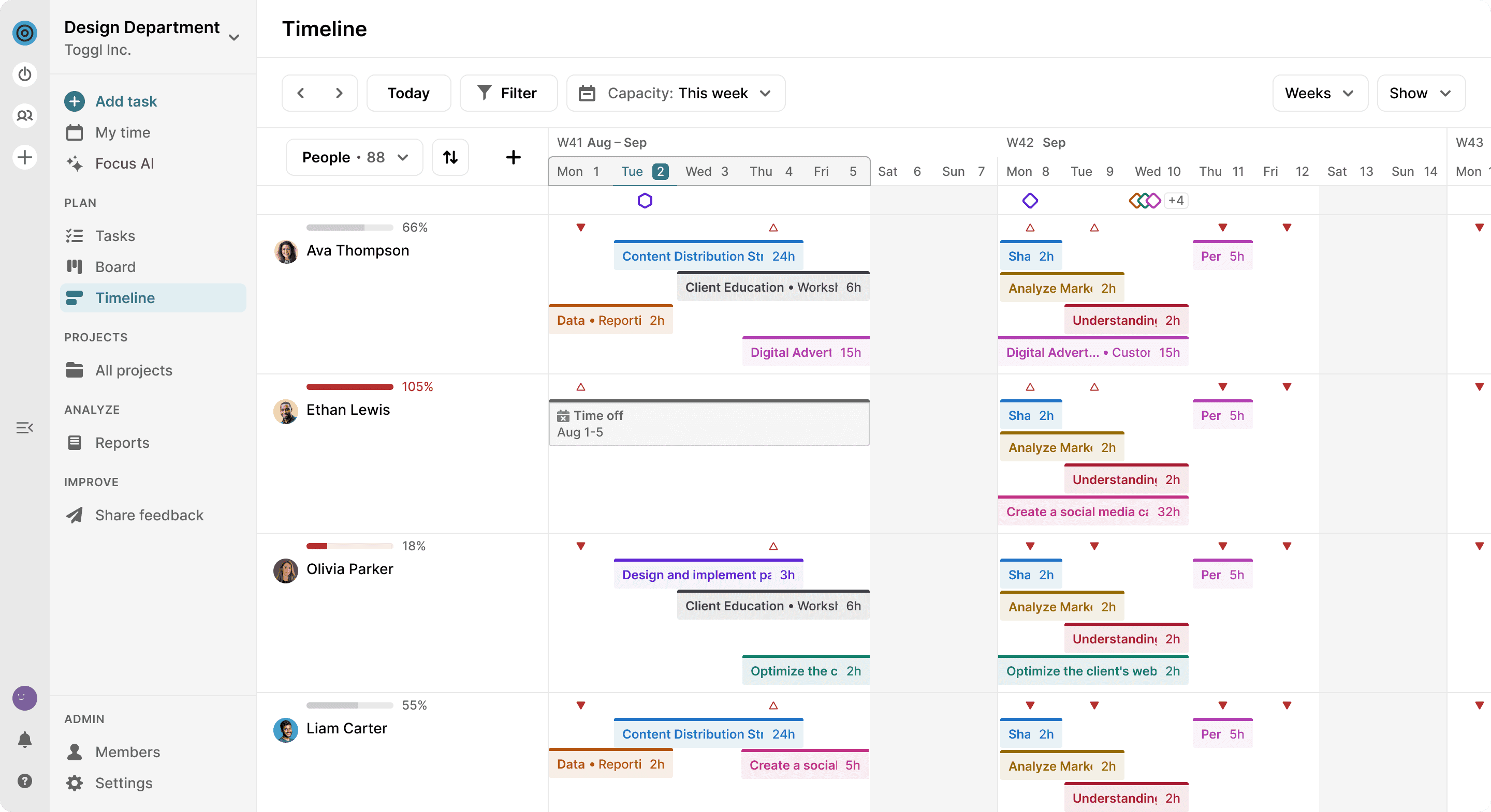
Balanced workloads
Spot overloads before they turn into burnout, or underloads before money slips away.
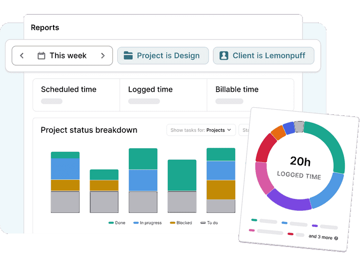
Messy spreadsheets out
Reports that make you a better decision maker.
Toggl Focus apps to keep your plans and time tracking aligned, wherever work happens
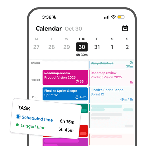
Mobile apps
Keep your plans moving, even when you're away from your desk.
Desktop apps
Built for daily planning, real schedules, and focused desktop work.

“I’m super excited. I love how you’ve combined Toggl Plan and Toggl Track. And the Calendar View is fantastic!”— Toggl Community feedback
“Toggl Focus is amazing. The UX is perfect and matches my workflow in a shocking way!”— Toggl Community feedback
“This is an amazing app!It has neatly consolidated my old workflow of juggling Google Tasks and Toggl”— Toggl Community feedback


Finally… the end of planning in the dark
Toggl Focus shines a light on your time, so every plan is grounded in reality.

For individuals
- Get started in minutes with a tool that’s simple, intuitive, and easy to use.
- Plan and track in one place — no more juggling apps or losing data between tools.
- Perfect for freelancers, contractors or small teams wanting better focus and smarter planning.

For teams
- Bring clarity and alignment to every project.
- See workload, capacity, and timelines in one shared space — so deadlines stick and burnout doesn’t.
- Designed for growing teams that need clarity and structure without the bloat.
Guesswork kills projects. Bloat blocks adoption.
Toggl Focus clears the way.
Finally see your capacity and projects with clarity you can trust.
