A PERT chart can help you plan how long projects will take, as well as identify and understand the interdependencies between tasks.
When it comes to successfully planning and managing projects, your job would be a whole lot easier if you had a crystal ball.
If you could just rub your hands over that glass orb and immediately understand what needs to be done, how long it will take, and how it’s all connected, keeping everything on track would be way less stressful.
Here’s the bad news: We don’t have a crystal ball for you. But, let’s follow that up with the good news: A PERT chart can help you visualize your project in a similar way—no magic required.
Intrigued? We thought so. Let’s dig into everything you need to know about using a PERT chart to more efficiently and effectively plan your team’s projects.
What Exactly is a PERT Chart?
PERT stands for Program Evaluation and Review Technique. Sounds fancy, right? The system was actually coined by the U.S. Navy when they were working on the Polaris Missile Project in the late 1950s.
PERT charts have continued to evolve since then—they even spurred a method used by the private sector called the Critical Path Method. That’s another term you’ll hear a lot in project management circles, and it’s remarkably similar to PERT charts.
But, let’s not confuse you—we’re going to stay focused on PERT charts in particular.
When you boil it all down, using a PERT chart helps project managers to:
- Schedule and organize tasks and activities within a project
- Determine the predicted time the entire project will take
- Understand how project tasks and activities are interrelated and dependent on one another
You can think of your PERT chart as a roadmap for your project. In fact, that’s exactly how Harold Kerzner describes it in his book “Project Management: A Systems Approach to Planning, Scheduling, and Controlling”:
It can be easily considered as a road map for a particular program or project, where all the major elements (or events) have been completely identified, along with their corresponding inter-relations.
In some ways, a PERT chart has similarities to a Gantt chart. However, a PERT chart is used more proactively to determine the best order of a project’s activities and the projected duration of those tasks, while a Gantt chart is used while a project is actually happening.
Additionally, a PERT chart uses time measurements (i.e. days, weeks, etc.) to indicate length of time, while a Gantt chart usually lists specific dates. Finally, some Gantt charts list who is responsible for certain tasks, while PERT charts don’t assign responsibilities.
Alright, here’s your next question: What exactly do PERT charts look like? They can vary pretty significantly depending on the specific project and scenario.
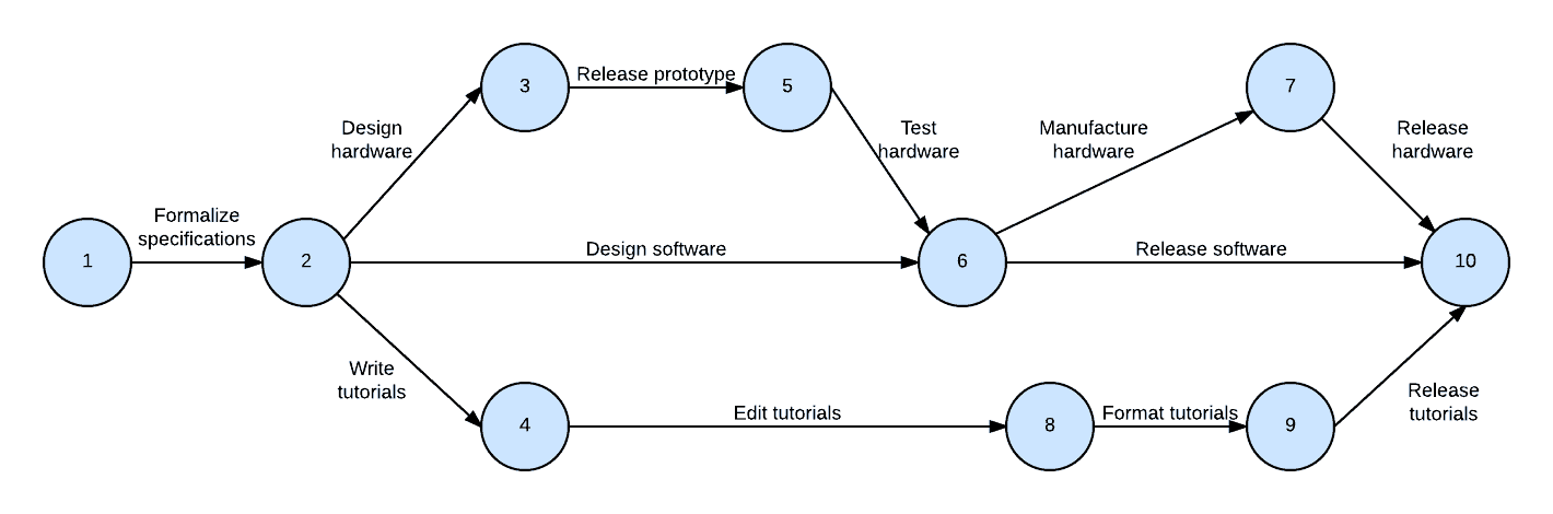
For example, PERT charts can be relatively straightforward and simple, like this one:
Or, they can become far more advanced and complex, like the below:
While the appearance of PERT charts can run the gamut, there are some basic principles that hold true regardless of how complicated your specific chart gets.
The Beginner’s PERT Chart Glossary
With that in mind, let’s cover a few of the terms you’ll see popping up again and again when creating PERT charts.
There’s no shortage of terms and concepts involved in a PERT chart (and we recommend checking out this helpful resource to dig into them all!).
But, for the sake of keeping this beginner-friendly, we’re going to define only the ones that you absolutely need to know to get started.
Milestone: You will also hear this referred to as a “PERT event.” This milestone represents the start or completion of a task (or several tasks) and uses no time or resources. For example, the start milestone indicates the start of the project and the finish milestone marks the completion of the project. Milestones are indicated with circles on the PERT chart. They can either be labeled with numbers or have the actual milestone written inside the circle.
Task: This can also be referred to as an activity. A task is just what it sounds like: something that requires time and resources and needs to be performed in order to push the project toward completion. These will most often be phrased as “verb noun” (i.e. “create guest list” or “design invites”). Tasks are represented with arrows on the PERT chart.
Be aware that there are two different types of tasks:
- Predecessors: These tasks come before a milestone
- Successors: These tasks immediately follow a milestone
Time: Because the PERT chart is used to help you determine how long a project will take, time is a key element of the chart. The time estimate is often listed below the arrow for each task. The PERT chart comes with four different ways you can estimate the time required for tasks.
- Optimistic Time (o): The minimum amount of time required to complete a task, when things go even better than you expected.
- Pessimistic Time (p): The maximum amount of time required to complete a task, when everything goes wrong.
- Most Likely Time (m): Your best guess as to how long it will take to complete a task, when things go exactly as you predicted.
- Expected Time (te): The most realistic estimate of how long a task will take, considering that even the best laid plans don’t always work out. Use the following equation to determine the expected time for a given task: te = (o + 4m + p) ÷ 6
Critical Path: This is the longest possible path from the starting milestone to the finishing milestone. Following this path shows you the amount of time the entire project will take. Any delay that occurs along the critical path means a delay for the entire project.
Slack: This is the measure of excess time and resources available to complete a task. It’s the amount of time a task can be delayed without causing delays for any subsequent tasks or the project as a whole.
Creating a PERT Chart: A Case Study
Alright, do you have the basics nailed down? There’s no better way to understand how a PERT chart functions than by building one. So, let’s setup an example scenario and put together a PERT chart of our own.
You and your team are designing a large ebook with the intention of collecting client leads. There are numerous steps to take, as well as different people and departments involved in making the ebook a success.
You want to understand exactly how long creating the ebook will take, so you know when you need to get started. Additionally, you want to understand how different tasks depend on one another (for example, you can’t do any design work until the outline is completed) so you do things as efficiently as possible.
Got it? Let’s build our PERT chart!
5 Steps to Create a Simple PERT Chart
1. Break your project down into milestones and tasks.
Now that you know there are two key elements of a PERT chart (milestones and tasks), you should start by listing out the different ones that are involved in your project.
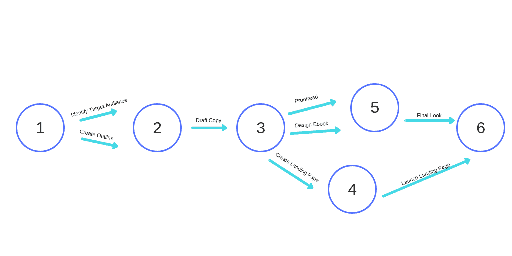
Using our ebook example, you could identify the following milestones and tasks as part of your overall project:
Milestones:
- Start Date
- Outline Completed
- First Draft Completed
- Tech Assets Completed
- Final Version Ready
- Ebook Launched
Tasks:
- Create outline
- Draft copy
- Design ebook
- Identify target audience
- Proofread copy
- Proofread again (final look)
- Create landing page
- Launch landing page
2. Spot any dependencies.
With your milestones and tasks all listed out, it’s time to turn your attention to the tasks in particular. What dependencies are there? What tasks can’t be completed without a different task happening first?
For example, you can’t design the ebook until you have some of the outline or copy completed.
Make note of these task dependencies now. Those will be important as you move to the next step and begin plotting out your PERT chart.
3. Plot out your PERT chart.
It’s time to start using the circles and arrows to plot out the best sequence for your tasks and milestones.
This can feel overwhelming at first (particularly if you have a complex project). So, I recommend starting by placing your beginning milestone and ending milestone on either end of your chart. Now, you can work to fill in the middle.
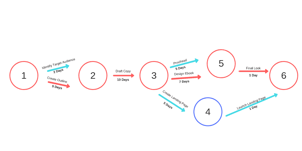
After doing so, we end up with a simple PERT chart that looks like this:
4. Add time estimates for each task.
Remember, the goal of your PERT chart was to figure out how long a specific project will take you. So, now it’s time to add in your time estimates underneath your task arrows.
Use the formula we outlined above to figure out the expected time for each task and then note that. After doing so, here’s what our PERT chart looks like:
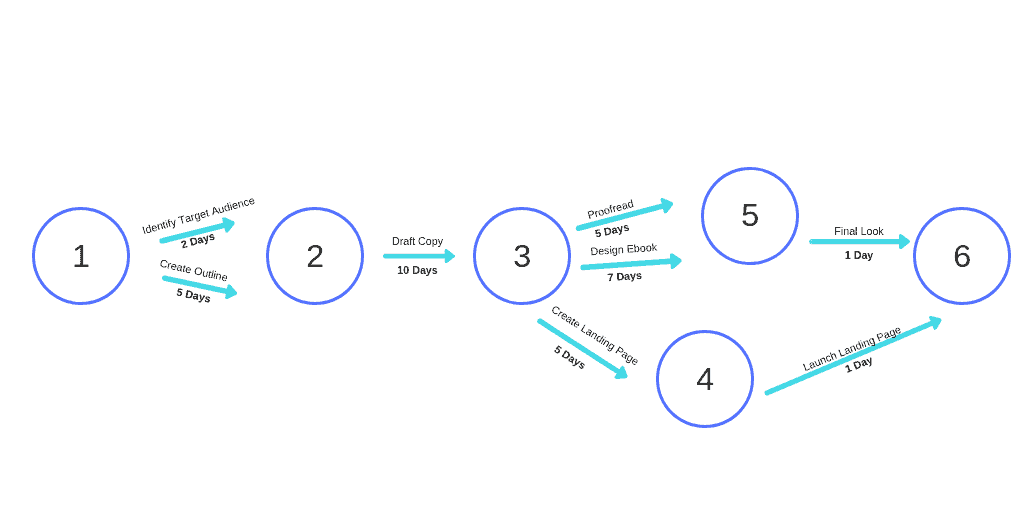
5. Spot your critical path.
If you’re using this PERT chart as a way to definitively figure out how long you should plan a project to take, your next best move is to look at the critical path (remember, that’s the path that will take the most time).
Add up the time estimates on your critical path. That’s how long the entire project should take from start to finish (in the case of this ebook, 23 working days). Any delays along that critical path will slow down your project.
Get Started With Your Own PERT Chart
See? It’s not quite as complicated as you assumed it would be, is it?
One more thing that’s important to note: Once your PERT chart is created, that doesn’t mean it’s set in stone. You can (and should) update the estimated time with actual times once you have an understanding of how long tasks actually take.
That will help you better plan your product schedule. And, it’ll be a huge help if you need to oversee a similar project in the future.
We know that a crystal ball would be undeniably handy when you’re in charge of managing a project—you’d love to know exactly what’s going to happen and how long those things will take.
Unfortunately, we don’t have a crystal ball laying around. But, we like to think that a PERT chart is the next best thing. Use one for your next big project that involves numerous tasks, and you’ll feel like you have at least a little bit of magic in your corner.

Kat is a freelance writer specializing in career, self-development, and productivity topics. She's passionate about being as efficient and effective as possible—much of which she owes to her 114 words per minute average typing speed. When her fingers aren't flying on the keyboard, she loves to bake, read, hike, or tackle yet another DIY project around her home.