Pretty much every project management tool today offers some way to visualize work — think Kanban boards, timelines, calendars, Gantt charts, dashboards, and more. On paper, that sounds like a win; in reality it’s pretty darn confusing when you’re trying to choose between tools. With so many visual options available, it’s not always clear which views your team needs, and which add noise.
This guide breaks visual project management down into its most practical forms and helps you choose the right tool for how your team works. We compare 10 of the best visual project management software for 2026, explaining which visualizations they support, who they’re best suited for, and where each one fits (or doesn’t). For a quick overview, the table below compares all 10 tools by use case, visual views, and pricing.
Best visual project management tools at a glance: Main views, use cases, and pricing
| Best for | Primary views | Free plan? | Pricing | |
| Toggl 2.0 | Time-backed project and capacity planning | Board, timeline, calendar, workload view | Yes for up to 5 users; core scheduling & time tracking | From $9/user/mo |
| Trello | Freelancers and very small teams | Kanban boards (with optional calendar/timeline via Power-Ups) | Yes for up to 10 collaborators | From $5/user/mo |
| Airtable | Operations teams | Grid (spreadsheet), Kanban, calendar, timeline, dashboards | Yes for up to 5 editors | From $20/editor/mo |
| Wrike | Agile teams | Boards, Gantt charts, timelines, dashboards, whiteboards | Yes for individual users | From $10/user/mo |
| Smartsheet | Operations and reporting teams | Grid (spreadsheet), board, Gantt, timeline, dashboards, resource views | Yes for 2 editors and viewers | From $9/user/mo |
| Kanboard | Tech-savvy teams | Kanban boards | Yes; it’s open-source | Free (donations welcomed) |
| Miro | Remote teams and designers | Infinite canvas, boards, mind maps, diagrams, timelines (via templates) | Yes for unlimited members | From $8/member/mo |
| Asana | Cross-functional teams | Lists, boards, timelines, Gantt-style roadmaps, dashboards | Yes for up to 2 users | From $10.99/user/mo |
| MeisterTask | Small-to-midsize teams | Kanban boards, timelines | Yes for up to 3 projects | From $13/user/mo |
| Milanote | Creative teams | Visual boards, canvases, embedded tasks | Yes for unlimited shared boards | From $9.99/person/mo |
Types of visual project management tools
Visual project management tools come in different formats, each designed to help teams plan, track, and understand work in their own special way. The following views make project status more obvious and less … cryptic.
| Visual type | Best for | What it helps you see fast |
| Visual boards (Kanban/Scrum) | Sprint work, team standups, bug tracking, workflows with frequent status changes | What’s in progress, what’s blocked, and what’s next |
| Timeline and Gantt charts | Deadline-driven initiatives like product launches, campaigns, projects with fixed milestones | What’s happening when (timeline) and how tasks are connected to each other (Gantt) |
| Flowcharts and process maps | Workflows, onboarding, process improvement | How work moves step-by-step, where decisions happen, and where handoffs break down |
| Dashboards | Portfolio oversight, workload monitoring | High-level progress, risk, and capacity signals as the “control center” |
| Mind maps | Brainstorming, early planning, concept development, and creative project management | How ideas connect before you commit to tasks, owners, and dates |
| Calendars | Editorial schedules, milestone planning | What’s due when — great for date-driven work, weaker on dependencies |
How do you choose a visual project management tool? 9 key criteria
With so many choices and overlapping feature sets across different visual project management tools, it’s a challenge to zoom in on your team’s needs. We recommend focusing on the following criteria as you compare contenders.
- Views: Common views include boards, timelines, calendars, dashboards, and workload charts, and each one answers a different question. The key isn’t having every view, but being able to customize and switch between those your team needs to plan and execute work.
- Ease of use: Prioritize adoption by looking for visual PM tools your teams will love. Third-party comparison sites like G2 include an Ease of Use score for each tool, enabling easy competitor comparison. Piloting a new tool is also a must. You might start with a single project or a small cross-functional team, then pay attention to how people behave once the novelty wears off.
- Flexibility and customization: A good visual project management tool shouldn’t force you to rename columns or shoehorn work into stages that don’t quite fit. Look for tools that let you customize statuses, fields, and views.
- Resource and workload management: Resource and workload views help teams see who’s available, who’s overloaded, and where work is likely to collide. This project information is vital when people split time across projects, or you have too many deadlines stacking up.
- Collaboration tools: The best team collaboration features reduce back-and-forth across tools by making ownership, progress, and decision-making visible where the work actually lives. Comments, mentions, shared views, and real-time updates are all essential if you want your teams to coordinate without playing hopscotch.
- Reporting and visibility: Good PM tools let teams export report data in clear, digestible formats such as PDFs or spreadsheets, send updates by email, or share live views through secure links. This makes it easier to keep clients, leaders, or partners informed on the metrics that matter without rebuilding the same report every time.
- Integrations: Every team has its stack of favorite tools. Integrations between them determine whether your new visual project management platform becomes a reliable source of truth or just another place to update. With your time tracking, team communication tools, file storage, and billing systems all connected, you’ll keep your data accurate and in sync.
- Scalability: If growth is on the horizon, choosing a tool that scales with you can save a painful migration later. Think beyond headcount and consider whether the tool can handle more projects, more dependencies, and more stakeholders without becoming cluttered or slow.
- Cost: Pricing models vary widely, especially when advanced features are locked behind higher tiers. But it’s about more than the headline price. Consider how costs might soar as your team grows, or, on the flipside, if you’re paying for features you don’t really need.
10 best visual project management tools for 2026
As a company that builds project planning, capacity management, and time tracking software used by teams worldwide, we spend a lot of time thinking about how teams visualize work in the real world. And we dug deep to put together our list of the best visual project management software in the market today.
Along with evaluating visual views and reporting across different team sizes and use cases, we also compared pricing models and feature depth. We also raked through hundreds of reviews and tool scores from third-party sites like G2 and Capterra to understand what users love (or don’t!) about each visual tool.
The result of our legwork is a balanced mix of lightweight tools, flexible all-rounders, and more robust platforms. Here they are.
1. Toggl 2.0: Best for teams requiring time-backed capacity planning
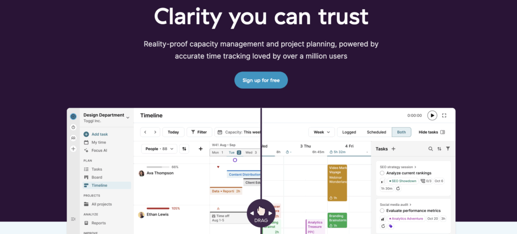
Toggl 2.0 combines visual project planning with our world-class time tracking and capacity management experience.
Unlike tools that bolt time tracking on as an afterthought, Toggl 2.0 builds every aspect of project management around time data. Because, after all, how can you really plan or visualize a project if you don’t know how long it’ll take? Our approach helps teams stay realistic about their availability, workload, and delivery timelines.
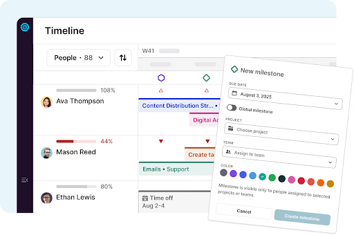
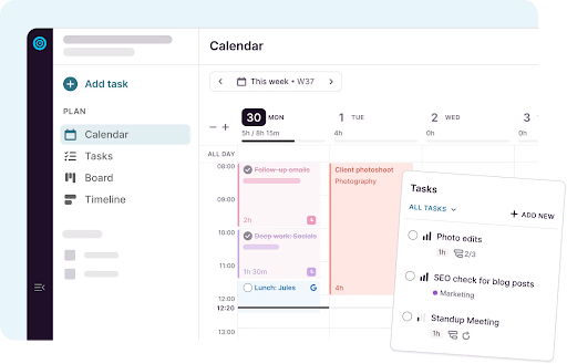
- Board, calendar, and timeline views to visualize work from daily execution to long-term planning
- Capacity and workload views that show who’s available (vs. overbooked) in real time
- Built-in time tracking that feeds directly into project progress, reporting, and planning
- Visual reporting for tracked time, project health, and utilization
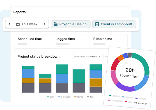
- Reports filtered by client, project, task, status, and priority, then exported as a .CSV
Pros
- Time tracking is built into everything, improving planning accuracy and reporting quality
- Clear workload visualization helps teams avoid overcommitting
- Clean, bloat-free interface that users consistently describe as easy to adopt
Cons
- Fewer advanced automation features than some enterprise PM platforms
- More focused on execution and capacity than early-stage ideation or whiteboarding
- Timeline views and workload reporting are only available on premium plans
Pricing
- Free: For up to five users. Includes time tracking, calendar/board/task views, personal productivity insights, and core scheduling essentials.
- Starter: $9 per user/mo. Adds timeline view, tags, milestones, and capacity basics, like PTO, public holidays, and flexible hours, and team visibility.
- Premium: $20 per user/mo. Adds full capacity management.
- Enterprise: Custom pricing is available for larger organizations needing scalable support.
What users think
“Switching to Toggl has been one of the best decisions for our team. From the moment we started using it, the platform’s intuitive and user-friendly interface stood out, making it incredibly easy to track time and manage projects. The detailed, customizable reports provide invaluable insights into our productivity and project progress, helping us identify areas for improvement and celebrate our successes.” — Yugo M., a small business founder
“Toggl 2.0 is amazing. The UX is perfect and matches my workflow in a shocking way!” — Toggl Community feedback

2. Trello: Best for freelancers and very small teams
Trello is one of the most recognizable visual project management tools, built around Kanban-style boards that each represent a different project. Its strength lies in simplicity; users move tasks (cards) from left to right using visual columns (lists), making progress easy to understand at a glance. But Trello has recently announced it won’t be “taking new feature requests related to project management.” Instead, it’s committed to “one single use case: capturing and organizing individual to-dos.” This makes Trello a good fit for solo users or micro teams.
Key features
- Kanban boards with drag-and-drop cards
- Labels, checklists, and due dates for lightweight visual cues
- Power-Ups to add calendars, project timelines, and integrations
- Simple automation through Butler rules
Pros
- Extremely easy to use, with almost no learning curve
- Highly visual boards that make task status obvious
- Flexible enough for many small-team use cases
Cons
- Limited reporting and analytics without paid add-ons
- Scales poorly for complex or multi-project environments
- Time tracking and resource planning are basic or rely on integrations
Pricing
- Free trial available
- Free plan available for up to 10 collaborators per workspace
- 3 premium plans: Standard, Premium, and Enterprise
- Premium pricing starts at $5 per user/mo
What users think
“Trello’s biggest strength is its visual simplicity. As we use Trello on a daily basis, it works well for tracking tasks, brainstorming ideas, and managing small to medium workflows. Moving cards as work progresses feels intuitive and keeps things organized.” — Ankit C., a software engineer
“The visual boards make it unbelievably easy to understand what’s happening in a project at a glance. I can step away, come back after a busy day, and still know exactly where everything is.” — Henry A., a product manager
3. Airtable: Best for operations teams
Airtable blends spreadsheet-style data with visual project views, making it popular with teams that want customization without committing to rigid PM workflows. It’s especially useful where projects are data-heavy or non-standard.
Key visual project management features
- Grid, Kanban, calendar, timeline, and gallery views for the same underlying data
- 200+ interactive templates, including visually driven use cases like user story mapping, UX research planning, content pipelines, and product roadmaps
- Visual dashboards built from multiple tables and views
- Custom fields, filters, and color-coded statuses for tailored visualization
- Automations and integrations to connect Airtable with external tools like Microsoft Teams and Google Drive
Pros
- Visual modeling, adaptable to many project types
- Template library, useful for UX, product, and creative workflows
- Multiple visual views from a single data source, reducing duplication
Cons
- Initial setup can feel complex to new users
- Costs scale quickly if teams need more than five editors
- Time tracking exists via a native extension, but isn’t central to project planning
Pricing
- Free trial available
- Free plan available for up to five editors
- 3 premium plans: Team, Business, and Enterprise Scale
- Premium pricing starts at $20 per seat/mo
What users think
“It feels like a mix of Excel and a project management tool, but way more visual and organized. I can customize everything from colors to views, and it helps me keep track of projects without feeling messy.” — Amrita S., a small business founder
“At my agency, GraphEra, we manage multiple client projects, and Airtable helps us keep everything organized, visual, and easy to track. The flexibility of customizing views, fields, and automations makes it fit perfectly with the way my creative team works.” — Arnav R., a creative designer
4. Wrike: Best for Agile teams
Wrike is a visual project management platform designed for teams managing complex projects across multiple stakeholders. As it supports Kanban-style boards, it’s a fantastic fit for software development lifecycles. But whatever your use case, its real strength is giving teams clear visibility into how work connects across timelines, owners, and priorities.
Key visual project management features
- Board view for visualizing task flow through customizable statuses
- Interactive Gantt charts and timelines to map dependencies and milestones
- Table and calendar views for alternative ways to understand the same work
- Dashboards that identify project progress, risks, and workload at a glance
- Wrike Whiteboard for brainstorming and visual planning
- Automation rules that visually move tasks or update fields as statuses change
Pros
- Strong visual visibility across multiple projects and portfolios, not just individual boards
- Combines execution views (boards, tasks) with planning views (Gantt, dashboards) in one system
- Native whiteboards support visual thinking before work becomes structured
Cons
- Requires deliberate setup to avoid overloading teams
- Interface can feel dense for teams with simple or linear project workflows
- AI Elite features are limited to higher pricing tiers
Pricing
- Free trial for 14 days
- Free plan available for individual users
- 4 premium plans available: Team, Business, Enterprise, and Pinnacle
- Premium pricing starts at $10/user/mo
What users think
“The task tracking feature in Wrike is indeed a standout. It helps you to stay organized. With visual progress indicators, you can quickly assess the status of each task and ensure deadlines are met.” — Dżesika M., a customer success manager
“The visual workflow management in Wrike has been a game-changer for our studio team. Being able to see projects in different views (list, board, Gantt chart) helps everyone on the team interact with the information in ways that work best for them.” — Ivan P., a head of studio
5. Smartsheet: Best for operations and reporting teams
If you can’t imagine a spreadsheet platform as a visual planning tool, that’s because you’ve never met Smartsheet before. Yes, it offers the familiar row-and-column model, but it also layers visual project management features on top. This flexibility makes it especially popular with operations, PMOs, and teams responsible for executive reporting.
Key visible project management features
- Wide range of views, including table/grid, board, timeline, Gantt, calendar, and resource views
- Interactive Gantt charts with dependencies and drag-and-drop scheduling
- Dashboards and Work Insights, with auto-generated visualizations, such as burndown charts and time-series reports, to spotlight trends
- Workload tracking to visualize availability, spot over-allocation, and rebalance work
- Conditional formatting to highlight risks, delays, or status changes visually
- Automation and alerts to keep visuals current without manual updates
Pros
- Broad set of visual views supports both planning and reporting needs
- Built-in insights and dashboards make trends easier to spot without manual analysis
- Familiar spreadsheet structure speeds adoption for data-oriented teams
Cons
- The free plan is quite limited compared to other tools
- Dashboard and insight setup can require upfront configuration
- Advanced resource management features require higher-tier plans
Pricing
- Free trial available for 30 days
- Free plan for two editors/viewers
- 4 premium plans available: Pro, Business, Enterprise, and Advanced Work Management
- Premium pricing starts at $9 per user/mo
What users think
“Creating dashboards from reports that combine multiple sheets is a great way to represent a general view on projects. The different options on the dashboard adds a nice visual.” — Ignace S., a retail application expert
“I greatly appreciate the visual aspects of Smartsheet, as it can easily display visually clear presentations, even for people with little background knowledge. This makes it a particularly useful tool in situations where I need to convey complex data to team members who may not be familiar with all the details.” — Tuur H.
6. Kanboard: Best for tech-savvy teams
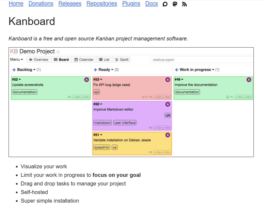
Kanboard is a free, open source project management tool focused on visual Kanban workflow management. Its deliberately simple experience centers on moving tasks across a board and using lightweight automation to reduce repetitive clicks. But it does all this without forcing you into a heavy interface or subscription model.
Key visual project management features
- Visual Kanban boards with drag-and-drop task cards
- Work-in-progress (WIP) limits that highlight when a column’s capacity is exceeded, helping teams spot overload visually
- Search and filter tools with a simple query language for finding tasks by assignee, category, due date, and more directly on the board
- Task details that include subtasks, attachments, comments, Markdown descriptions, and color-coded categories
- Automatic actions to update task attributes or move cards based on triggers, reducing repetitive manual work
- Self-hosted setup with support for LDAP, Active Directory, and OAuth2 login options.
Pros
- No subscription costs
- Full control over your data
- Simple interface that’s easy to install and configure
Cons
- Limited views beyond Kanban
- Self-hosting may be a barrier for non-technical teams
- Core feature set is intentionally minimal
Pricing
- Free, open-source platform
- Donations are invited
What users think
“I suggest Kanboard if it’s your first approach to project management with an agile methodology. It’s easy to install and simple to use for all stakeholders.” — A COO of a logistics and supply chain firm
“I use Kanboard every single day to manage my team’s work. I like that because it’s self hosted, my data is my own. Because it’s open source and free, I don’t worry about the cost of additional seats when I add new users.” — Eric M., a CEO of a computer software company
7. Miro: Best for remote teams and designers
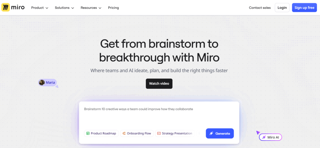
Miro is a visual collaboration workspace built around an infinite canvas that supports everything from brainstorming and mind mapping to project planning and execution. Teams can move from big-picture thinking to structured visual plans, combining sticky notes, diagrams, boards, charts, and templates all in one shared space.
Key visual project management tools
- 7000+ templates and frameworks, including project planning, Kanban boards, timelines, mind maps, and process flows (all ready to customize)
- Real-time collaboration, letting multiple team members edit and comment together live or asynchronously
- Mind maps, flowcharts, sticky notes, and diagrams to visualize ideas, dependencies, and workflows early in a project
- Timeline and Gantt-style views via templates to track schedules and milestones.
- 250+ integrations with popular tools, so visual planning connects with execution platforms
- Interactive presentation mode to turn boards into shareable presentations
Pros
- Exceptional flexibility
- Template library filled with thousands of ready-made visual frameworks
- Real-time shared workspace
Cons
- Learning curve can be steep for advanced features
- Performance may be slow for large boards
- The power of the canvas can also feel unstructured
Pricing
- Free trial available
- Free plan available for unlimited members
- 3 premium plans available: Starter, Business, and Enterprise
- Premium pricing starts at $8 per member/mo
What users think
“As a creative professional, having a visual, flexible space for planning is essential. Miro makes it easy to organize ideas, map out projects, and see the bigger picture without feeling constrained. It really elevates the planning stage, which in turn makes execution far smoother and more enjoyable.”— Cayla L., an author and illustrator
“The infinite canvas really shines in how easily you can move between perspectives: zooming out to see the 30,000-foot view, then diving straight into the nitty-gritty details with nothing more than a scroll of the mouse. That fluidity makes it ideal for working through complex ideas without losing context.” — Jeff R., a small business CEO
8. Asana: Best for cross-functional teams
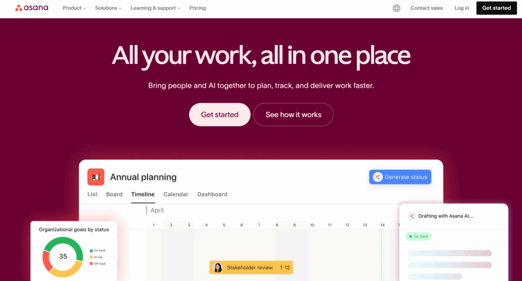
Asana helps teams track and optimize work from start to finish with a single shared workspace. It supports multiple project views and combines them with strong automation, goal alignment, and reporting capabilities.
Key visual project management features
- Multiple synchronized views, including list, board (Kanban), calendar, timeline, and Gantt-style roadmaps
- Custom fields and color-coding to visually segment work by priority, status, or team
- Reporting dashboards that turn project data into live visual summaries of progress, risks, and trends
- Goals and Portfolios that visually tie work to strategic outcomes
- Resource views and workload balancing to visualize team capacity and adjust assignments in real time
- Rules and automation to reduce repetitive manual work
- AI-powered recommendations via Asana AI (e.g., Smart Workflow Gallery and AI Studio) to assist with organization and focus.
Pros
- Celebration creatures at task completion add delight to progress
- Easy for teams to switch perspectives without losing context
- Strong integrations are available with hundreds of apps, including Slack, Google Drive, and Zoom
Cons
- Advanced visualization and workload features require higher-tier plans
- Interface may feel bloated for smaller projects
- May involve a steep learning curve
Pricing
- Free trial for 30 days
- Asana Personal is available as a free tier for 2 users
- 4 premium plans available: Starter, Advanced, Enterprise, and Enterprise+
- Premium pricing starts at $10.99 per user/mo
What users think
“I love how visual and flexible it is — whether managing sprint boards, planning campaigns, or tracking deliverables, everything just flows.” — Rhea J., a product manager
“I absolutely love the visual task management system in Asana, particularly the board and timeline views, which make it incredibly easy to understand priorities. These views allow me to track progress visually and quickly spot bottlenecks across tasks, which enhances the overall efficiency of my task management.” — Prasanna R., a support lead
9. MeisterTask: Best for small-to-midsize teams
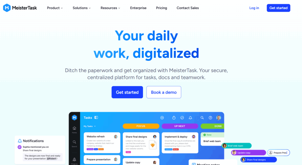
MeisterTask is a visual work and task management tool that keeps projects organized through intuitive boards and purpose-built templates. Its focus on visual clarity helps teams break work into assigned tasks and track progress across them.
Key visual project management features
- Visual Kanban boards
- Templates for capacity planning and resource allocation
- Timeline view (available on Business and higher plans) to chart tasks over time and spot schedule conflicts
- Real-time notifications and reports that highlight progress across teams
- Task details with subtasks, to-do lists, tags, and attachments keep work structured and visible
- Built-in time tracking and reporting so teams can log hours and generate quick insights into effort and bottlenecks
Pros
- Strong visual workflows for tracking progress at a glance
- Templates make setup faster
- Lightweight interface and clear notification system
Cons
- Advanced scheduling features are locked behind premium plans
- Resource planning isn’t as robust as enterprise tools
- Less suited to large project portfolios or cross-project views
Pricing
- Free trial available
- Free plan available for up to 3 projects with unlimited tasks
- 3 premium plans available: Pro, Business, and Enterprise
- Premium pricing starts at $13 per user/mo
What users think
“MeisterTask has so much functionality, and helps you keep your projects organized in a beautifully visual way. It’s super easy to use and very user intuitive.” — Joel P., a managing director
“I’m really picky about the UX and visual design of products I use day-to-day. Most task management apps just aren’t that well-designed. Meistertask is! It’s fun and colorful, yet easy to read and use, even with large numbers of tasks.” — Abe C., an advisor
10. Milanote: Best for creative teams
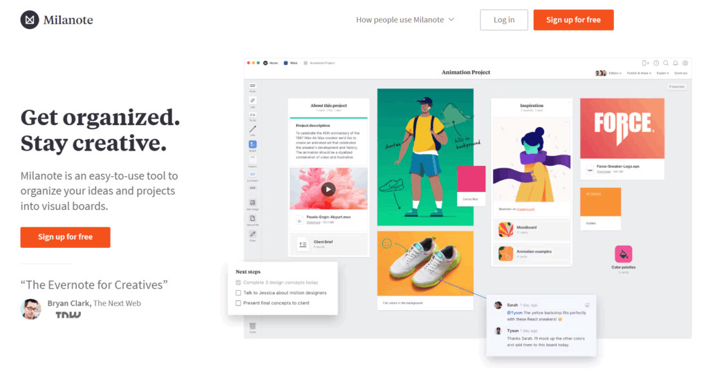
Milanote offers a highly visual project planning and idea workspace where notes, images, links, docs, and tasks can live side-by-side in any layout that makes sense for your project. It mirrors how creative teams think and work, letting inspiration and project documentation take shape organically rather than living in linear task lists.
Key visual project management features
- A digital creative wall with a drag-and drop interface that lets you arrange content anywhere on the canvas
- Rich media support (images, design files, videos, audio, PDFs) with built-in search via Pexels for visual inspiration
- Task integration and checklists embedded directly on boards, letting you blend ideation with actionable items
- Collaborative workspaces, including online whiteboards, where teams share and refine ideas together
- Extensive templates for briefs, storyboards, and project planning to jumpstart creative workflows
- Web clipper for saving inspiration straight into your Milanote boards
Pros
- Lack of rigid structure, great for creative minds
- Easy commenting and sharing for better collaboration
- Generous free plan
Cons
- Limited project management views beyond Kanban
- No built-in feature for task dependencies
- May not offer the breadth of customization you need
Pricing
- Free trial available
- Free plan available for unlimited shared boards
- 2 premium plans available: Per person and per team
- Premium pricing starts at $9.99 per person/mo
What users think
“What I like best about Milanote is its beautiful, visual interface that allows me to organize thoughts, ideas, and projects like a digital whiteboard. It’s perfect for creative work — from moodboards and storyboards to strategy maps and content planning.” — Manila B., a digital marketing strategist
“Milanote is intuitive, visual, easy to use, it makes your ideas flow easily and the Chrome extension does a great job collecting information for your boards. You can attach any kind of documents or information and relate it with other information pieces.” — Bernardo B., a midmarket user
7 best practices for using visual project management tools
You can have the prettiest graphics in the world, but if they don’t help your teams make informed decisions, they’re not working for you. Follow these best practices to make sure your visuals give you just the right amount of information at the right time.
1. Start simple and define clear goals
Start by deciding what this visual is meant to help you do. Pick one primary goal, such as hitting a deadline or maximizing your resources, and design the view around it, rather than trying to support everything at once.
2. Use time data as the foundation for visual planning
Visual project plans only work if they’re grounded in reality. Without accurate time data, your timelines and workload views are built on nothing more than assumptions about how long your work should take. And us humans are prone to getting those estimates wrong.
Make visual plans more accurate from the start by using tracked time to inform estimates, capacity, and availability. With the right data, your teams can check if their deadlines are realistic and how much work individuals can take on. If the data says your timelines need to flex, you can step in and make changes before overcommitment becomes a problem.
3. Define clear workflow stages
Use workflow stages your team can apply without overthinking. The goal is that two people looking at the same task would both put it in the same place.
4. Use work in progress limits
Work-in-progress limits help you visualize when individuals or teams are trying to do too much at once, a.k.a a one-way ticket to burnout. WIP limits provide a visual cue to back up and take action to reduce the overload.
5. Limit columns and statuses to reduce overwhelm
Many project management tools compete by adding more features, views, and statuses that all sound impressive on paper. But showing too much at once often makes it harder to understand what’s happening, especially for people who only dip into the tool occasionally.
6. Use color-coding and visual cues
The human brain quickly processes certain visual features, including color, highlighting what needs attention first. In particular, research shows red tends to capture attention and is consistently associated with higher perceived hazard in warning contexts.
But that doesn’t mean you should color everything red. If red means urgent, and important, and blocked, it stops communicating anything at all. Pick one meaning per color, and make sure each meaning maps to a distinct action.
Here’s a simple, evidence-aligned starting scheme:
- Red = blocked / cannot proceed (requires action to unblock)
- Amber = at risk (needs attention soon, but still moving)
- Green = on track (no action needed)
Then use non-color cues, like priority labels or icons for anything else, so “red” stays reserved for the highest-signal state.
7. Implement real-time updates
Project management tools are only useful if the visuals are accurate, and that means updating them in real time. For example, a team member could update a task status from their project management tool’s mobile app, so the change instantly appears on shared dashboards for the team.
8. Review with key stakeholders regularly and archive aggressively
Visual project management tools work best when they’re shaped around the people who actually use them. To achieve this, try scheduling a biannual or annual review to check whether dashboards still answer the right questions for contributors, managers, and stakeholders. At the same time, archive completed projects and unused reports so your current work isn’t buried under historical clutter.
Visualize your way to better project delivery with Toggl 2.0
Visuals help us see work clearly, using boards, timelines, and dashboards that are readily available across project management platforms.
The real question is whether those visuals are telling the truth. When plans are built on assumptions, even the best-looking roadmap will eventually break. But when they’re built on time data, teams can see what’s possible (and what isn’t) before you make any commitments.
Ready to see what changes when your project visuals relate to how your work actually happens? Sign up to Toggl 2.0 for project visuals grounded in reality.
FAQs about visual project management tools
What is visual project management?
Visual project management uses visual aids like charts, boards, timelines, and graphs to give teams a clear, shared picture of what’s happening. Instead of wading through heavy textual documentation, teams use a visual project management tool to receive an immediate overview of key details.
Why are visual project management tools important?
Visual project management tools exist to reduce coordination friction. Here’s how they make sense of complex work without squinting at spreadsheets.
- Clearer understanding: Visual tools make it easier to grasp what’s happening without reading long explanations or chasing updates.
- Greater transparency: When work is visible, progress and blockers are shared by default rather than hidden in inboxes or meetings.
- Stronger collaboration: Project teams get the same view of the work, making handoffs smoother and discussions more productive.
- Faster status checks: Visual overviews reduce the need for status meetings by showing progress at a glance.
- Earlier bottleneck detection: Blocked tasks, overloaded teammates, or stalled work stand out visually, making issues easier to address early.
- Better accessibility for non-technical teams: Visual formats are easier to understand than text-heavy tools, especially for stakeholders who don’t live in project management solutions.
- Enhanced support for creative workflows: Flexible visual views adapt well to creative work, where ideas evolve, and structure emerges over time.
How can you visualize project management?
You can visualize project management by using different views that show tasks, timelines, workflows, and progress at a glance. Common approaches include:
- Kanban or Scrum boards for tracking work in progress
- Timelines or Gantt charts for planning work over time
- Dashboards for monitoring status, workload, and risks
- Calendars for deadline-driven schedules
What are the 5 Cs of project management?
The 5 Cs of project management typically refer to five principles that support successful delivery:
- Clarity: Clear goals, roles, and priorities
- Communication: Shared understanding and regular updates
- Collaboration: Teams working together across roles
- Coordination: Managing dependencies and timing
- Control: Tracking progress and adjusting when needed
Visual project management tools support these principles by making plans and progress easier to see and discuss.
What tools are commonly used to visualize a project’s schedule?
Teams visualize a project’s schedule by using tools that display work across timelines, Gantt charts, or calendars. Commonly used tools include:
- Toggl 2.0, which lets teams track projects and plan timelines based on real capacity and time data
- Asana, which helps teams map projects and milestones on a timeline
- Miro, which teams often use for early-stage scheduling and high-level planning
- Smartsheet, which combines spreadsheet-style planning with Gantt charts
- Wrike, which supports detailed scheduling with task dependencies
How do you visualize the progress of a project?
Visual indicators show how work is progressing in real time. Common techniques include:
- Progress bars or battery-style widgets to show completion at a glance
- Color-coding (for example, green for on track, amber for at risk, red for blocked)
- Status labels or icons to indicate task states without opening each item
- Dashboards and summary views that roll individual task updates into an overall progress signal
Together, these visual cues give teams an at-a-glance overview of project progress without relying on written status updates.
What are some practical applications of visual project management tools?
Visual project management tools support different types of work across a variety of industries, including:
- Healthcare: Coordinating care workflows, staffing schedules, and compliance processes
- IT and software: Managing sprints, backlogs, releases, and dependencies
- Education: Planning curricula, managing academic projects, and coordinating teams
- Marketing and creative teams: Running campaigns, content calendars, and production workflows
- Professional services: Managing client projects, capacity, and delivery timelines
In each case, visual tools keep teams aware of what’s happening without the overwhelm of unnecessary details.

Rebecca has 10+ years' experience producing content for HR tech and work management companies. She has a talent for breaking down complex ideas into practical advice that helps businesses and professionals thrive in the modern workplace. Rebecca's content is featured in publications like Forbes, Business Insider, and Entrepreneur, and she also partners with companies like UKG, Deel, monday.com, and Nectar, covering all aspects of the employee lifecycle. As a member of the Josh Bersin Academy, she networks with people professionals and keeps her HR skills sharp with regular courses.
![What is Resource Smoothing in Project Management? [Guide]](https://toggl.com/blog/wp-content/uploads/2023/12/resource-leveling-673x404.jpg)