The right productivity metrics ask a hard question: what did the hours we log and tasks we completed really produce?
Instead of focusing on attendance and work hours, good productivity metrics measure business essentials like billable revenue, projects delivered on time, or client retention.
This article covers 14 productivity metrics, organized into four categories: output, efficiency, time-based, and quality. Each comes with a formula, benchmark, and how you can measure it with Toggl Track.
What are productivity metrics?
Productivity metrics are quantifiable measures that assess how efficiently individuals or teams convert time, effort, and resources into valuable output. Unlike activity metrics, which count actions (hours logged, emails sent, tasks assigned), productivity metrics measure outcomes: the value created per unit of time invested.
Unfortunately, most teams think they’re tracking productivity, but what they’re usually tracking is activity. And there’s a meaningful difference between these two terms. Activity metrics simply tell you that someone’s busy. They’re easy to collect and report, and measure things like:
- Hours logged
- Tasks assigned
- Emails sent
- Meetings attended
However, they’re not real measures of performance or business impact. Presence does not equal contribution, and a full calendar doesn’t necessarily move the needle on impact.
The only productivity metrics worth tracking (and what each one tells you)
We chose the following 14 team productivity metrics which each connect directly to business outcomes, rather than just activity or time spent.
Output metrics
Output metrics are where most teams start. Used together, the following metrics give you a full picture of delivery rate, team efficiency, and project health.
Tasks or projects completed
Tasks or projects completed is a count of work items delivered within a defined period, such as sprints, months, quarters, or billing cycles. On its own, this metric is the most intuitive productivity signal: did the work get done?
Use this formula to measure the total number of tasks or projects completed.
Tasks Completed = (Tasks completed ÷ Tasks planned) x 100
Benchmark: A common target for planned task completion is 70-80%. Consistently hitting 90% can signal under-planing and below 60% typically points to scope creep or capacity problems. Note that these are just reference points, not hard rules.
Limitation: Volume without quality context is misleading. A high completion count can reflect genuine output or it can reflect work that got marked as complete before it was.
In Toggl Track: Pull a detailed report, set your preferred time period, and filter by projects. You can see the total time spent, including how much was billable.
Revenue per employee
Revenue per employee is a ratio that captures the overall relationship between your revenue output and the size of your workforce. Use the following formula as a calculation.
Revenue per Employee = Total revenue ÷ Total headcount (FTE)
Benchmark: The 2024 cross-industry average was approximately $350,000, but benchmarks vary enormously by sector ($100,000 in retail and up to $1 million in energy, for example).
Limitation: As a lagging indicator, it won’t tell you why productivity is up or down. A high ratio can reflect genuine efficiency, an overworked team, or heavy contractor use that masks true headcount. Use it for benchmarking but not as a standalone metric.
In Toggl Track: You can use Toggl’s profitability reports to see revenue generated by specific team members against their labor costs.
Project completion rate
Project completion rate is simply the percentage of projects delivered on time and within scope in a given period. Calculate it with the following formula:
Project Completion Rate = (Projects delivered on time and within scope ÷ Total projects undertaken) × 100
Benchmark: Only 36% of organizations “mostly” or “always” complete projects on time, while just 49% of them complete projects on budget. If you’re consistently below those figures, it might be a scoping or planning problem.
Limitation: On-time delivery doesn’t mean much if scope was altered to get there. Pair this metric with error rate and client satisfaction to separate genuine delivery from managed expectations.
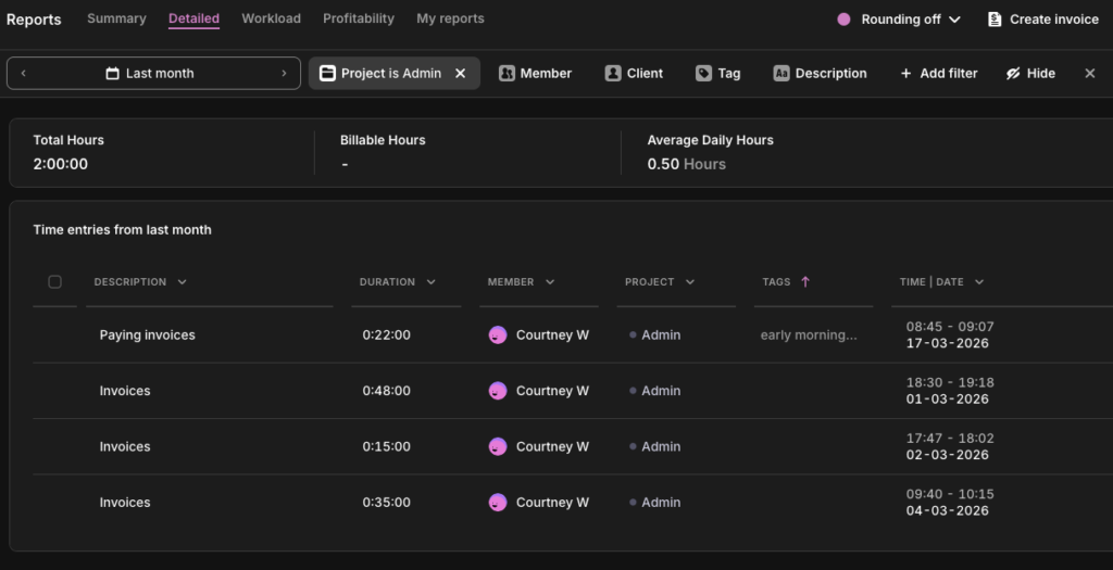
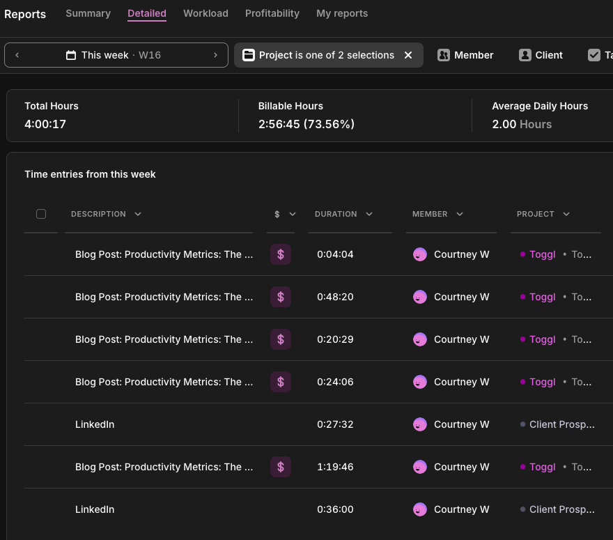
In Toggl Track: Use Toggl’s Project Dashboard to compare estimated hours against actuals for each project. A project that closed within its time estimate and didn’t require scope expansion is your baseline for “on time and within scope.” You can also filter by date range to track completion rate across quarterly or annual billing cycles.
Efficiency metrics
Efficiency metrics are where the activity-vs-outcome distinction gets expensive. Hours logged is an activity metric and billable utilization is a productivity metric. They can tell completely different stories about the same team, and only one tells you whether the business is protecting its bottom line.
Billable utilization rate
Billable utilization rate is the percentage of your team’s available time that’s generating any revenue. For agencies and consultancies, this metric separates “busy” from “profitable.” Here’s a formula you can use.
Billable Utilization Rate = (Billable hours ÷ Total available hours) × 100
Benchmark: According to SPI Research’s 2025 Professional Services Maturity Benchmark, 75-80% is the established target range for billable utilization in delivery roles. It’s high enough to drive profitability and sustainable enough to avoid burnout.
Limitation: Utilization measures time sold, not value delivered. Pair it with project profitability data to get the full picture.
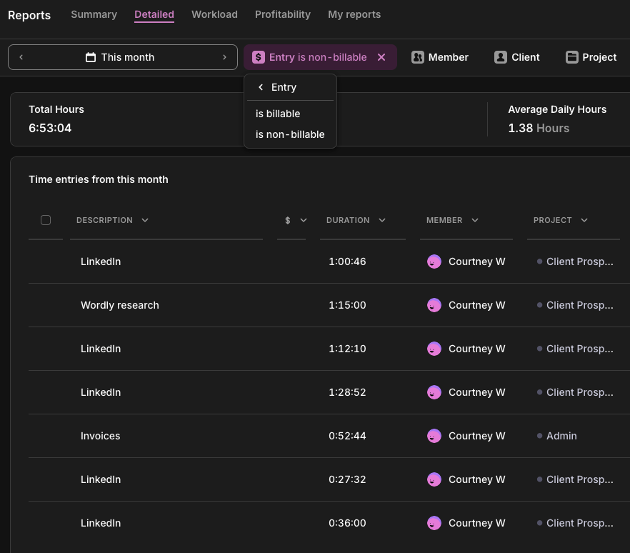
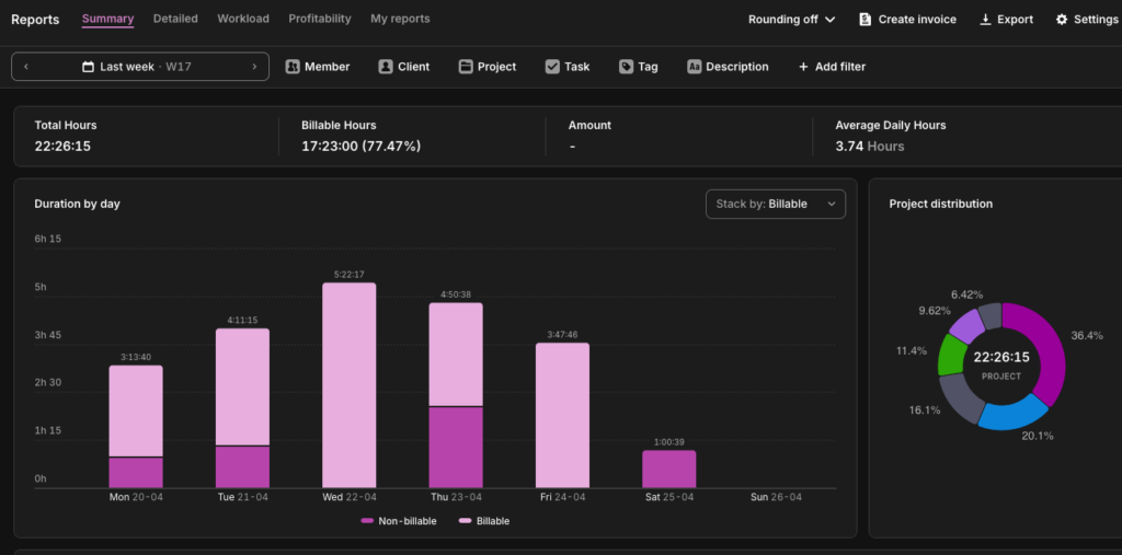
In Toggl Track: Pull the Summary Report filtered by billable vs. non-billable. You’ll see exactly how any available time is split across any team member, project, or date range.
Employee utilization rate
Where billable utilization counts only revenue-generating hours, employee utilization is broader, capturing all delivery time, including non-billable client work like onboarding, training, and discovery. Use the following calculation:
Employee Utilization Rate = (Delivery hours ÷ Total available hours) × 100
Benchmark: Most benchmark data treats billable and employee utilization interchangeably, so direct comparisons are imperfect.
Limitation: Employee utilization isn’t a great standalone metric. As a best practice, read it alongside billable utilization. Someone logging 90% on internal admin isn’t the same as 90% on client work.
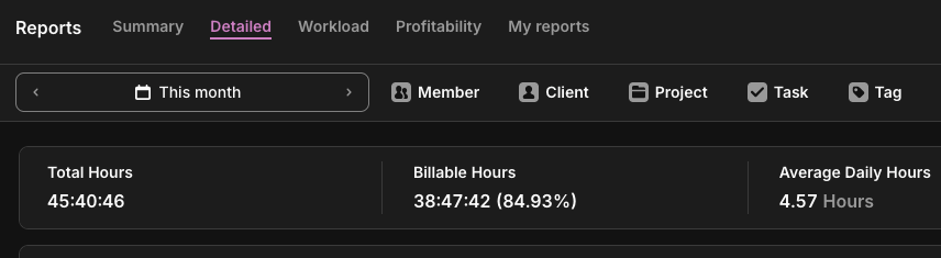
In Toggl Track: Run the Summary Report across all hours, billable and non-billable, to see total delivery against time capacity. Filter by team member to see who’s overloaded on capacity and who’s got room. This is where capacity planning should start: not in a blank Excel sheet but in the data you’ve already collected.
Estimated vs actual time variance
Track the gap between how long you thought work would take and how long it actually did, using the estimated vs actual time variance metric using the formula below. Persistent overruns show that either the scope isn’t defined clearly or the work was never understood.
Time Variance = ((Actual hours − Estimated hours) ÷ Estimated hours) × 100
Benchmark: No universal standard exists for this metric, which is telling. Generally, anything beyond a 10% variance triggers questions.
Limitation: Consistently finishing well under target isn’t always good news. It can mean you’re underscoring the work, cutting corners, or leaving money on the table with your pricing.
In Toggl Track: The Project Dashboard auto-measures estimated vs. actual hours. Set a time budget when you scope the project and track against it in real time. You’ll see variance trends long before it becomes an awkward client conversation.
Time-based metrics
Most teams have plenty of time data, but they’re missing the right frame for it. These four metrics take the hours your team is already tracking and ask where, how effectively, and at what cost instead of just how many.
Planned-to-done ratio
As one of the most honest signals in productivity measurement, this tells you how much of what you committed to was completed. A low score using the following formula usually means your planning is off, not that your team is underperforming.
Planned-to-Done = (Tasks completed ÷ Tasks planned) × 100
Benchmark: Across Agile and knowledge work practice, 80% or above is a widely accepted target. It’s high enough to reflect genuine commitment but low enough to allow for realistic planning.
Limitation: This metric only tells you if the planned work gets done, not if the right work was planned in the first place, whether your team plans in hours, story points, or task counts. By this measure, a team hitting 90% on low-priority tasks while high-value tasks sit in the backlog looks like success.
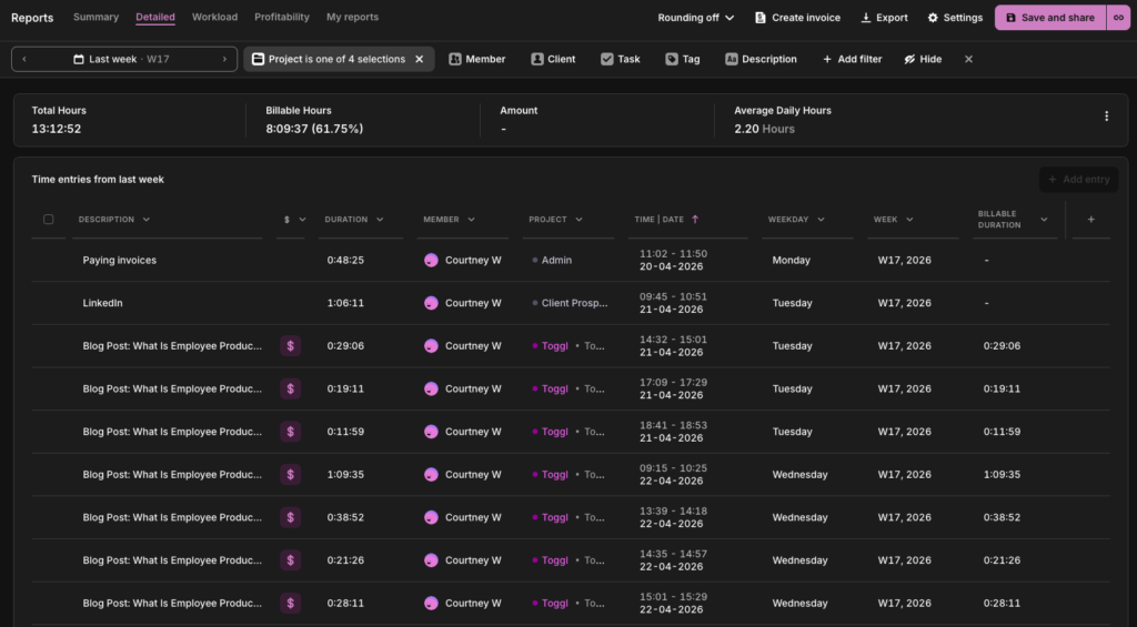
In Toggl Track: Use the Detailed Report filtered by project and date range to see time logged against specific tasks. Teams on the Starter plan can mark tasks as done when complete. Those entries remain visible in Reports, giving you a record of what was worked on across a period. Cross-reference against your planned task list to calculate the ratio manually.
Cycle time
Cycle time is one of the most honest efficiency signals available because it’s based on actual elapsed time. It measures how long a task or project takes from the moment work begins to the moment it’s done. Use the following formula as a calculation.
Cycle Time = Date work completed − Date work started
Benchmark: No universal benchmark exists for cycle time in knowledge work. Task complexity varies too much across roles and industries for a single number to be meaningful. The metric’s real value comes from establishing a baseline using your own historical data.
Limitation: Cycle time measures elapsed active time, not calendar time. A task that took three hours of work but sat waiting for client feedback for a week will look fast by this measure. If handoffs and approvals are part of your workflow, track full elapsed time from request to delivery alongside cycle time; this is often where bottlenecks are hiding.
In Toggl Track: Log time against specific tasks from start to finish. Over time, the Detailed Report gives you the average time per task type, per team member, across periods, which is your cycle time data. Compare task types across team members to spot skill gaps or process inconsistencies.
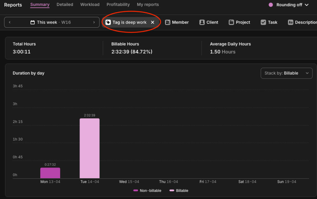
Focus time percentage
The share of tracked time spent in uninterrupted, deep work (as opposed to meetings, admin, and reactive communication) is your focus time percentage. It can be an uncomfortable metric for most teams, as the numbers tend to be worse than expected. The following calculation will reveal your numbers:
Focus Time = (Deep work hours ÷ Total tracked hours) × 100
Benchmark: 60% of knowledge workers’ time is spent on coordination tasks, leaving 40% for deep focus work. If your deep work hours fall below 30%, consider adjusting meeting schedules and making informal policies about when and how your team can interrupt each other.
Limitation: This metric requires honest, consistent tagging to be meaningful. It’s only as reliable as your team’s time tracking habits.
In Toggl Track: Tag time entries as ‘deep-work,’ ‘meetings,’ or ‘admin,’ and view the breakdown in the Summary Report. The act of tagging itself tends to make people more intentional about where their time goes.
Non-billable time distribution
While billable utilization tells you how much of your time is generating revenue, non-billable distribution tells you where the rest of it is going. The calculation is simple:
Non-Billable Distribution = (Hours in category ÷ Total non-billable hours) × 100
Benchmark: No primary research benchmarks the internal split of non-billable time by category, which means you’re benchmarking against your own history and not an industry standard.
Limitation: Like focus-time percentage, this metric is only as useful as your tagging discipline. Without consistent categorization across the team, the distribution data is meaningless.
In Toggl Track: Tag non-billable entries by type, such as ‘admin,’ ‘internal meetings,’ ‘training,’ etc., and view the breakdown in the Summary Report. Over time, you’ll see whether your overhead is being invested or merely absorbed.
Quality metrics
You can hit every activity metric there is (think hours logged, tasks completed, utilization targets met) and still lose the client. Quality metrics are the correction. They don’t measure whether the work happened, but whether it was worth doing.
On-time delivery rate
The percentage of projects or tasks delivered by their agreed deadline is known as the on-time delivery rate. It’s one of the most visible productivity signals to clients and stakeholders and an important productivity metric for leaders. According to Toggl’s Productivity Index, 45% said on-time delivery rate is their top measure for gauging their company’s productivity. Here’s how to track yours:
On-Time Delivery Rate = (Projects delivered by deadline ÷ Total projects) × 100
Benchmark: According to SPI Research’s 2025 Professional Services Maturity Benchmark, on-time project delivery rates across professional services fell to 73% in 2024, down from 80% in 2021. For knowledge teams, 80% or above is a reasonable target.
Limitation: On-time delivery says nothing about what was delivered. Pair this metric with error rate and client satisfaction to get a clearer understanding.
In Toggl Track: Cross-reference your on-time delivery rate with estimated vs. actual time data in the Project Dashboard. If projects are late and actual logged time significantly exceeds estimates, it’s likely a scoping problem.
Error rate
Your error rate is how often delivered work comes back for correction. A consistent pattern of revision requests usually points upstream, to brief clarity or workload. Use this formula:
Revision Rate = (Work items returned for correction ÷ Total work items delivered) × 100
Benchmark: Benchmarks here depend on industry. In software engineering, elite teams maintain rework rates between 3-7%. In knowledge or creative work, though, some iteration is normal and expected, so the 3-7% threshold would be way too tight. If you’re not in an industry that has clear benchmarks, you should check for trends in your own error rate reporting to get an idea.
Limitation: In genuinely iterative work like creative development, research, or strategy, some revision is the process itself. This metric is most useful when you define upfront what counts as a correction versus a scope evolution, and track them separately.
In Toggl Track: Log revision cycles as separate time entries tagged ‘revision’ against the original project or task. Over time, the Summary Report will show what proportion of project time is going to corrections rather than first-pass delivery. Projects or clients with consistently high revision time are worth a closer look. They may be underpriced, underscoped, or both.
Client satisfaction (CSAT/NPS)
CSAT measures client or customer satisfaction at a specific touchpoint; Net Promoter Score (NPS) measures whether a client would stake their reputation on recommending you. There are two formulas you can use:
CSAT = (Satisfied responses ÷ Total responses) × 100
NPS = % Promoters − % Detractors (scale of −100 to +100)
Benchmark: Based on research from Retently, a CSAT score above 70% is generally considered a good baseline, while 75-85% is strong across most B2B and professional services contexts. Like most of the metrics mentioned in this list, however, a declining or increasing trend in client satisfaction is more useful to your organization than an industry benchmark number.
Limitation: CSAT and NPS measure perception, not performance. Perception is shaped by expectation just as much as by delivery. A client with unrealistic expectations can give you a low score on a project that went well. Pair satisfaction data with objective delivery metrics to separate genuine quality signals from expectation management issues.
In Toggl Track: Toggl Track doesn’t collect satisfaction data directly, but integrations with Asana and Jira let you connect time data to project outcomes. With this, you can correlate satisfaction scores with delivery patterns. Projects that overran their estimates, missed deadlines, or had high revision time tend to show up in lower CSAT scores.
Which metrics matter for your role?
Not every metric in this list applies to every team. A freelance consultant doesn’t need cycle time, for example, while an in-house knowledge worker doesn’t need billable utilization. The table below maps the most relevant team productivity metrics to the roles likely to be using them.
| Role | Productivity KPIs |
| Agency or client services | Billable utilization rateEstimated vs. actual varianceProject completion rateCSAT |
| Software developer | Cycle timePlanned-to-done ratioOn-time delivery rateFocus time percentage |
| Consulting / freelance | Billable utilization rateRevenue per employeeNon-billable time distributionEstimated vs. actual variance |
| Customer support | On-time resolution rateError rateCSATPlanned-to-done ratio |
| Knowledge workers / in-house teams | Focus time percentagePlanned-to-done ratioOn-time delivery rateTasks completed |
How to implement productivity metrics
Teams fail to track productivity by trying to track too many things at once, reviewing their data too infrequently, or never clarifying what they’re tracking and why. Here’s how to measure productivity without adding reporting overhead.
1. Choose 2-3 metrics that match your business model
Start narrow. An agency should probably start with billable utilization and estimated vs. actual variance. A freelancer might start with revenue per hour and non-billable distribution. Tracking too many metrics at once creates noise and paralysis. You end up with a dashboard that nobody looks at.
2. Establish a baseline before trying to improve
Whether it sits with operations, finance, or human resources, the principle is the same: run one month of consistent time tracking before setting any targets. You can’t optimize what you haven’t measured, and many of the metrics on this list rely heavily on baseline data rather than industry benchmarks.
3. Share metrics with the team, not just management
Transparency is what converts metrics into accountability tools. When people can see their own data, including utilization rates, completion ratios, and focus time breakdowns, they self-correct faster. They’re also more likely to buy into improvement initiatives than when numbers are reported to managers behind closed doors.
4. Review weekly or biweekly, not monthly
Monthly reviews are too infrequent to catch problems before they compound. A 15-minute weekly review of a few of Toggl Track’s reports is more useful than a monthly all-hands with three-week-old data.
5. Pair quantitative metrics with qualitative check-ins
Numbers explain what’s happening, but conversations explain why. Metrics and teamwork aren’t opposites. The data gives you the question, and the follow-up gives you the context. For example, a rising revision rate or dip in planned-to-done ratio means something, but the metric alone won’t tell you what. Get into the habit of asking the questions behind the number.
Reviewed consistently alongside feedback loops, each of these metrics becomes the foundation of continuous improvement — not just a snapshot of where your team stands, but a system for getting better.
The metrics trap: what not to measure
There’s a version of productivity measurement that looks rigorous, generates plenty of numbers, and tells you almost nothing useful. Here’s what that looks like.
Activity instead of output
Keystrokes logged, mouse movements tracked, and screenshots taken every 10 minutes are all great indicators that someone is at their computer. But honestly, they’re pretty creepy surveillance tactics that tell you absolutely zilch about whether they’re producing anything valuable.
Toggl’s 2025 Productivity Index found that 70% of leaders are comfortable using surveillance software, while 65% admit it’s contributing to a disengaged workforce, which is one of the strongest predictors of attrition. Toggl is strictly anti-surveillance, and always will be. If you want to understand what your team is producing, the metrics in this article will tell you far more than any monitoring software ever could.
For those organizations or industries that require remote employee monitoring, we’d always recommend you implement other metrics from this list alongside that monitoring if you want a true productivity picture.
Hours worked without context
40 hours logged on low-value admin isn’t a better week than 30 hours on high-impact client work. Total hours only mean something when paired with what those hours produced and at what cost. On its own, hours worked is an attendance metric used for payroll, not performance.
Metrics that incentivize the wrong behavior
A high task completion rate achieved by padding the backlog with small, easy tasks is worse than a lower rate with harder, more valuable work. The test of a good productivity metric isn’t whether it can be hit, it’s whether hitting it actually means something. Choose metrics that reward the outcomes you want, not the behaviors that make the numbers look good.
Where productivity metrics live in Toggl Track
Most of the metrics in this article don’t require any custom dashboards, data exports, or surveillance software. Toggl Track streamlines reporting with the following four types of report.
Summary Report
If you only look at one report, make it this one. The Summary Report shows you how your team’s time is distributed before you try to change anything, and it’s all automated from the time entries your team is already logging.
- Billable utilization rate
- Employee utilization rate
- Focus time percentage
- Non-billable time distribution
Detailed Report
When the Summary Report flags a problem, the Detailed Report tells you where to look. It breaks the time down to the individual entry level across every person, task, and project.
- Cycle time
- Tasks completed
- Planned-to-done ratio (cross-referenced against your task list)
- Error rate (when revision cycles are tagged separately)
Project Dashboard
If your projects are overrunning, this is where you’ll see it: budget burn, time estimates vs. actuals, and scope creep are all visible before it reaches the client.
- Estimated vs. actual time variance
- Project completion rate
- On-time delivery rate
Insights
Insights closes the loop between time tracking and business performance, showing whether the hours your team logs are generating the margins you need.
- Revenue per employee (cross-referenced with your finance system)
- Project profitability
- Billable utilization rate at the project and client level
Ready to reveal your numbers? Try Toggl Track for free. Or if you want a structured starting point, the one-week productivity audit walks your team through the measurement process step by step before you set a single target.
Frequently asked questions about productivity metrics
What are examples of productivity metrics?
Examples of productivity metrics include billable utilization rate, project completion rate, planned-to-done ratio, estimated vs. actual time variance, on-time delivery rate, cycle time, focus time percentage, revenue per employee, and client satisfaction (CSAT/NPS). Genuine productivity metrics measure value created, not activity logged.
What is a good employee productivity rate?
A solid employee productivity rate depends on the metric and the role. For billable utilization, 75-80% is the established target range for delivery roles in professional services. For planned-to-done ratio, 80% or above is widely considered healthy. For project completion rate, Wellingtone’s 2026 State of Project Management report found that only 36% of organizations mostly or always complete projects on time. The most useful benchmark is always your own historical baseline: is the number improving, stable, or declining?
How is productivity measured in the workplace?
Productivity in the work environment is measured by tracking the relationship between inputs (time, effort, headcount) and outputs (projects delivered, revenue generated, client satisfaction). This involves choosing a small number of employee productivity metrics that reflect how your team creates value and reviewing them consistently over time. Productivity tools like Toggl Track identify most of these metrics directly from time tracking data, without requiring additional systems or manual reporting.
What are KPIs for employee productivity?
The most commonly used key performance indicators (KPIs) for employee productivity across knowledge work and professional services include billable utilization rate, on-time delivery rate, project completion rate, planned-to-done ratio, estimated vs. actual time variance, cycle time, focus time percentage, and client satisfaction score. The right KPIs depend on your role and business model. Agencies and consultancies should prioritize utilization and variance, in-house knowledge workers should prioritize focus time and planned-to-done, and client-facing teams should include CSAT and NPS.
What’s the difference between productivity metrics and performance metrics?
Productivity metrics measure how efficiently time and resources are converted into output, i.e., billable utilization, cycle time, and project completion rate. Performance metrics is a broader category that can include productivity but also covers behavioral, developmental, and goal-based measures like OKR achievement, skill progression, or peer feedback score.
Often, both terms are often used interchangeably, but a high performer who is unproductive is a resourcing problem. A productive employee who is underperforming on broader business goals is a different kind of problem. Both are worth tracking but they require different data.

Courtney is a content strategist who helps B2B SaaS companies turn complex offerings into messaging their audience actually understands. She writes about SaaS tools and productivity for the teams that use them most: agencies, consultancies, and professional service firms. She's been in this space since 2019, long enough to know which game-changing apps actually changed anything.

