Although it comes with limitations, creating a Gantt Chart in Excel is still the go-to charting method for many professionals.
It isn’t easy and quick (as you’ll see next). And the charts aren’t great looking.
But even though Excel doesn’t create the prettiest charts, it helps you get the job done.
If you’re interested in functionality rather than the look of your Gantt Charts, read on to learn how to:
- Make a Gantt chart in Excel in eight steps
- Style your Excel Gantt chart
- Use Excel Gantt chart templates
Let’s get into it!
How to Make a Gantt Chart in Excel: Step-by-Step Guide
It takes eight steps to make a Gantt chart in Excel. Ready? Let’s dive in.
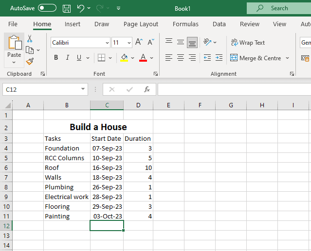
Step 1: Create a project data table
- Create a new Excel spreadsheet.
- Add the columns for your project tasks. Each task should be defined with a task name, start date, and duration (the number of hours, days, weeks, or months it’s going to last).
Here’s a sample worksheet for a simple construction project:
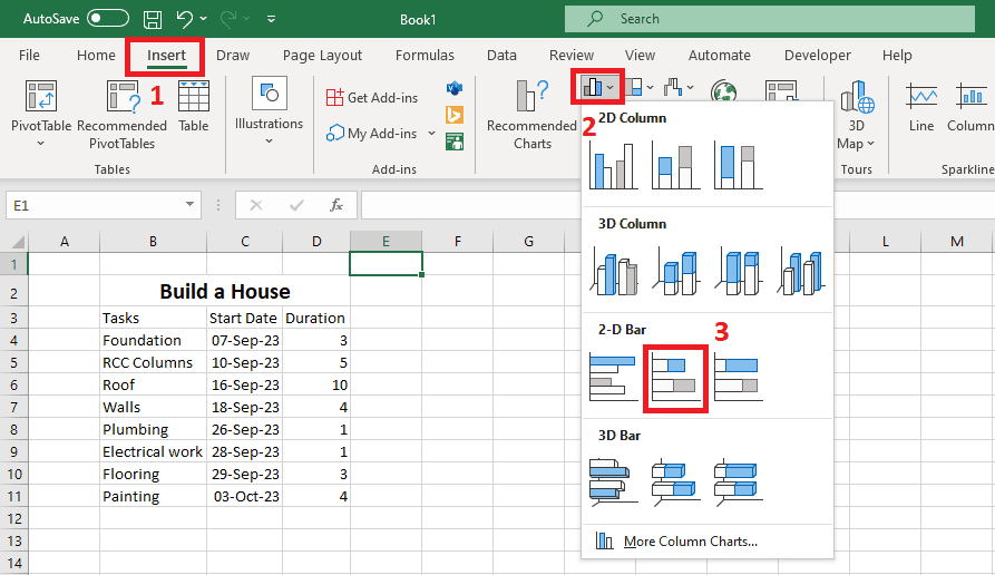
Step 2: Set up a stacked bar chart
Excel does not come with an inbuilt Gantt chart template.
Instead, we’ll create one using a stacked bar chart.
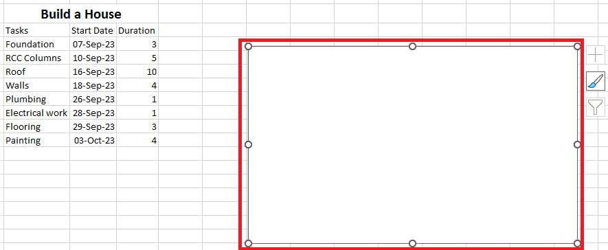
- Select your task information. Next, click on Insert tab > Bar Chart > Stacked Bar Chart.
The new chart will be a block of white space, like this:
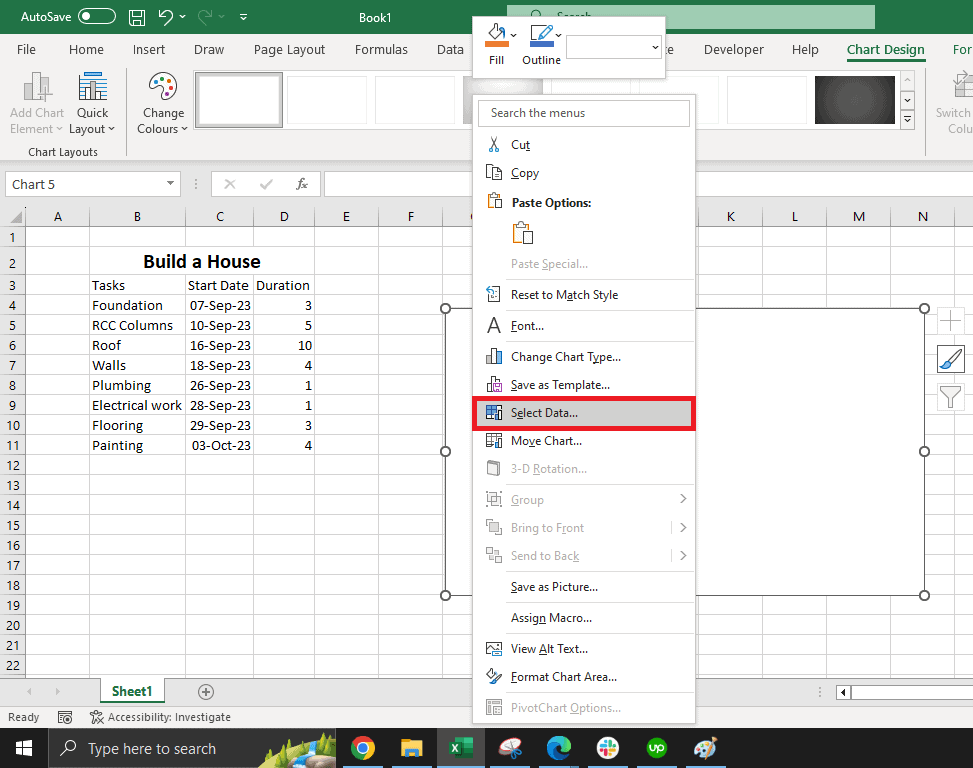
Step 3: Add start dates to the chart
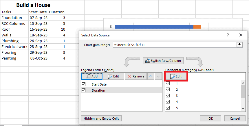
Let’s populate the chart with our task data. To do that, right-click on the chart. Then click Select Data.
2. This opens the Select Data Source dialog. Here, we’ll set the Legend Entries to task start dates and durations.
Click on the plus button in the Legend entries (series) section to add the range of start dates first.
3. Set the Series name to “Start Date”.
To do that, click on the empty field next to Name.
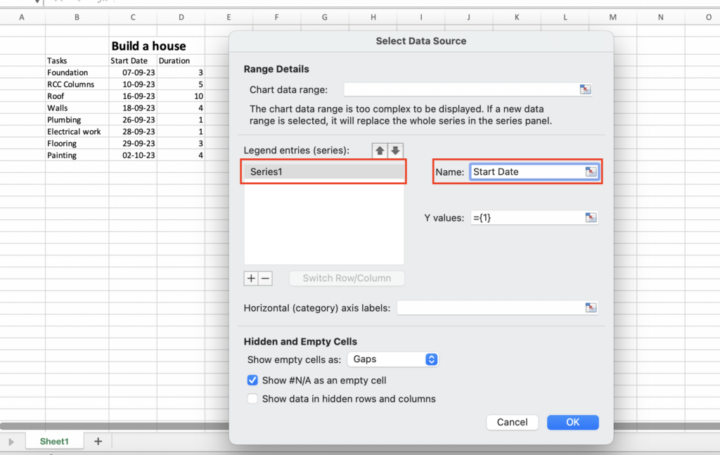
Note: If you select the cell with the title and then change it later on, the Series name will change along with it.
But, if you type up the name and then later change the title of the column in the spreadsheet, the name will remain the same.
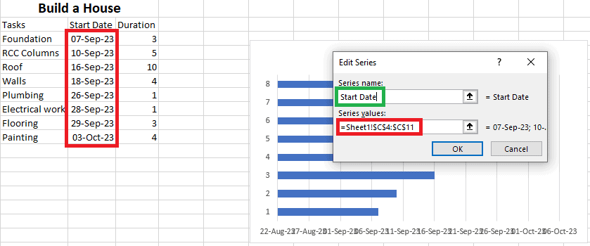
4. Set the Series values to the cell range that contains the task start dates.
In the Edit Series window, to the right of the Series values, click on the arrow pointing up and a smaller Edit Series window will appear. Click on the first start date in your table and drag your cursor down to the last start date. Click on the arrow again to return to the previous Edit Series window and click OK.
Step 4: Add duration data to the chart
1. After adding your start dates, it’s time to add duration data. To do this, click on the Add button in the Select Data Source screen.
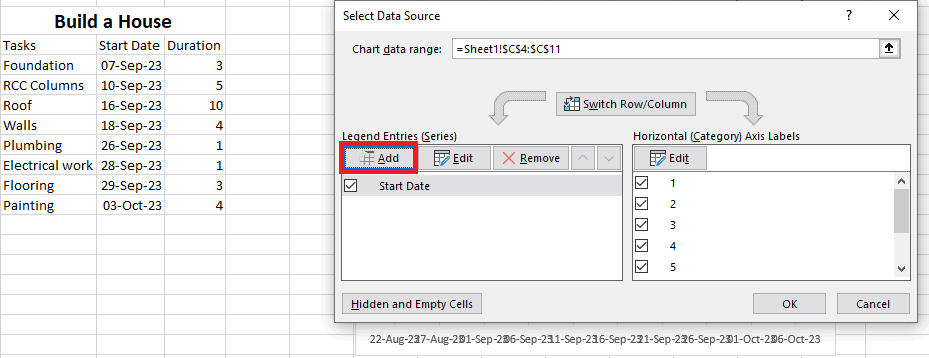
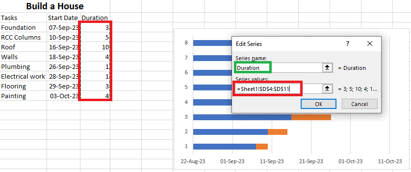
2. Set the Series name to “Duration”. The same as the third section of the previous step.
Set the Series values to the cell range that contains the task durations. The same as the fourth section of the previous step.
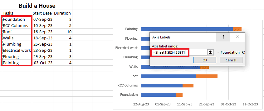
Step 5: Add task descriptions to the chart
1. Next, we want to add the task descriptions (names) to the vertical axis. This is done by editing the horizontal (Category) axis labels.
In the Select Data Source window, click on the Edit button to add task names to the horizontal (Category) axis labels.
2. Here, simply click on the first task in your table and drag your cursor down to the last task. (notice how the Axis label range field will be automatically filled).
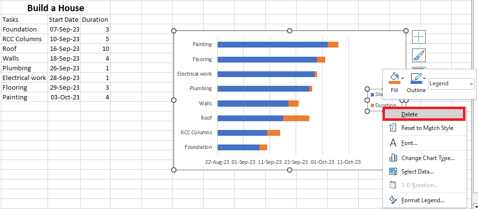
3. Bonus: In case a chart label block shows up on your chart and you don’t want to have it there, right-click on it and select Delete.
Step 6: Transform the bar chart into an Excel Gantt chart
The stacked bar is ready. Your tasks are laid out on the chart as orange and blue bars.
But, it doesn’t look like a Gantt chart.
Let’s format it to look like one.
1. Right-click on the blue part of the bar. Then click on Format Data Series… to open the Formatting dialog.
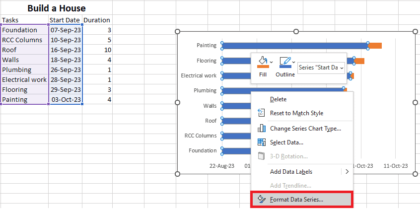
2. In the dialog, set the Fill option to No fill.
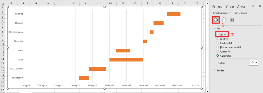
Now our chart looks a bit more like a Gantt chart.
But it still has a couple of issues:
- The tasks on the vertical axis are in reverse order.
- The start date range on the horizontal axis is too wide.
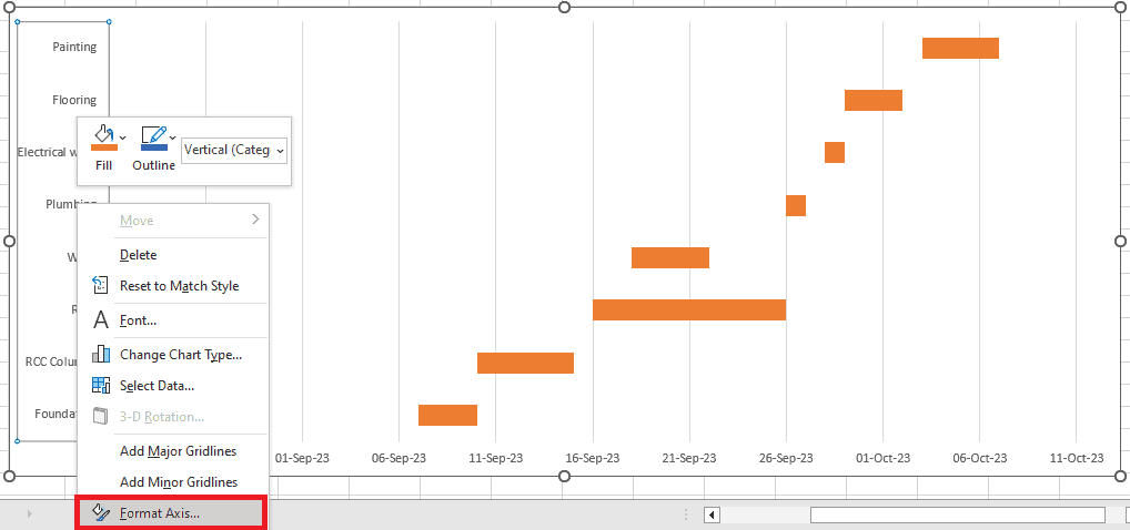
Step 7: Fix the task order
1. To fix the issue of the reverse task order, right-click on the vertical axis.
2. Then click on the Format Axis… context menu to open the Format Axis dialog.
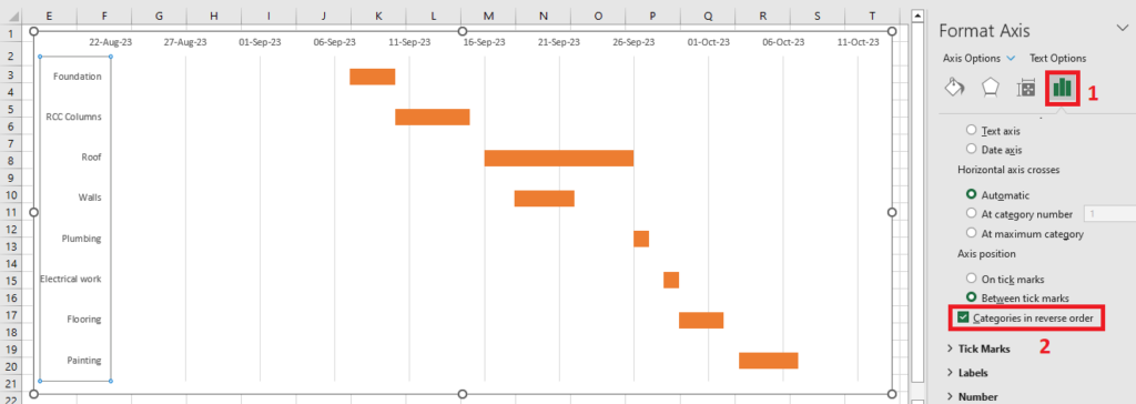
3. In this dialog, check Axis Options > Categories in reverse order. The tasks should now appear in the right order.
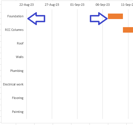
Step 8: Remove the empty space at the left-hand side of the Gantt chart
Next, let’s remove the white space on the left-hand side to bring our tasks closer to the vertical axis.
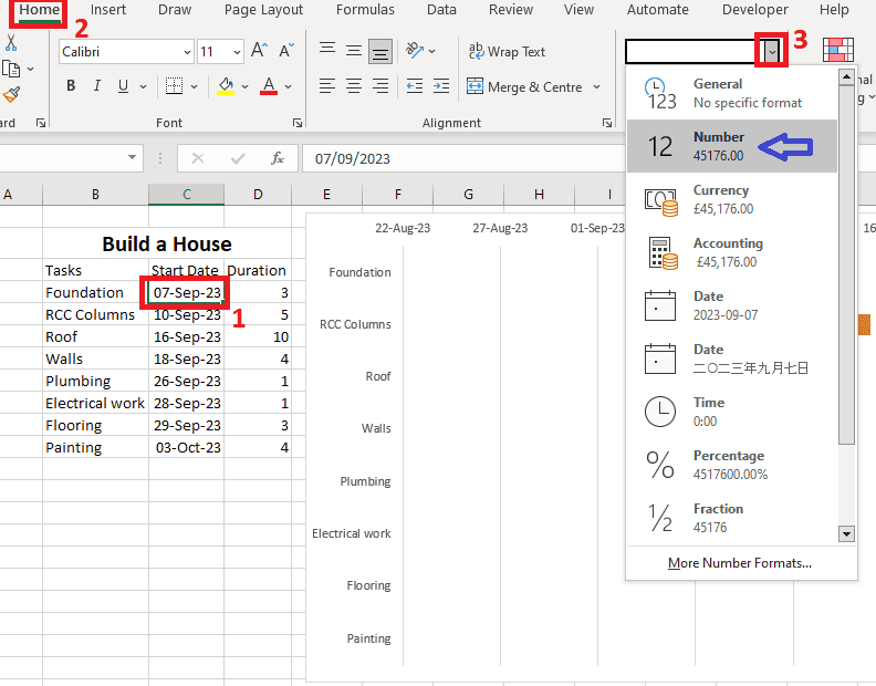
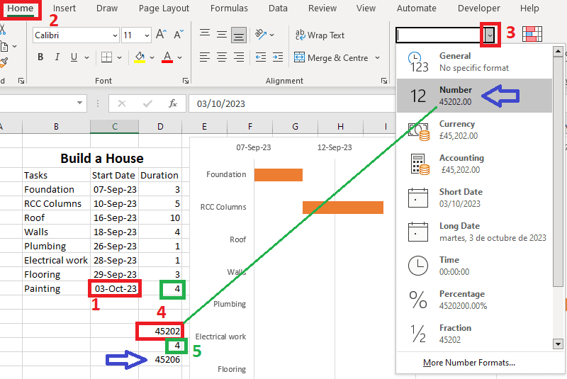
1. Select the first Start Date in your data table, then drop down the Number Formats list (under the Home Tab).
See the number shown in the Number option (in this case 45176), and write it down for the next step.
Click on any cell in the sheet again to close this window as you don’t want to make any changes here.
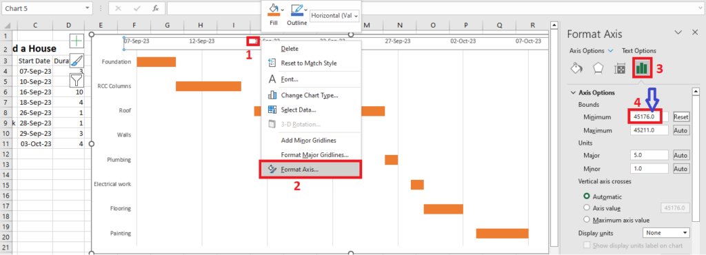
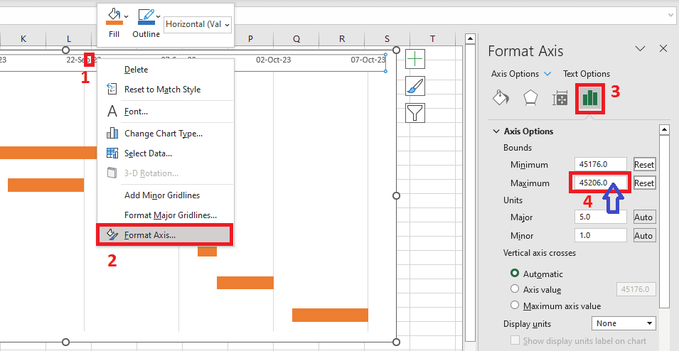
2. Right-click on any date above the task bars on your chart and open the Format Axis dialog box.
3. Set Axis Options > Minimum Bound to the number you wrote down in the first step.
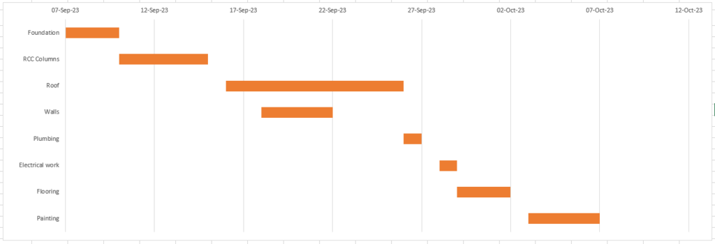
With that done, your Excel Gantt chart is ready, showing each task and its start and end date. Any changes you make to the data will also reflect automatically in the chart.
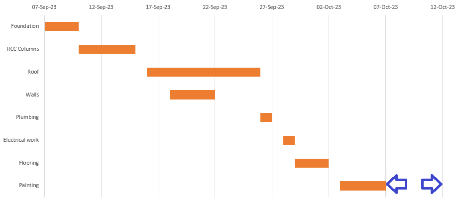
Bonus: Remove the empty space at the right-hand side of the Gantt chart
Now, your Excel Gantt chart will not be good-looking.
But don’t let that discourage you.
Polish things up by removing white spaces to prettify your chart. Here’s how to do it:
1. First, click on the last date in your list and check its number as we did in Step 8. Then, add this number in the duration column, in this case 4.
2. Right-click on any date above the task bars on your chart and open the Format Axis dialog box.
Set Axis Options > Maximum Bound to the number you got by adding 4 to the last start date number.
Excel Gantt Chart Styling Tips
Continue with the chart’s makeover to give it some edge.
Here are some tips:
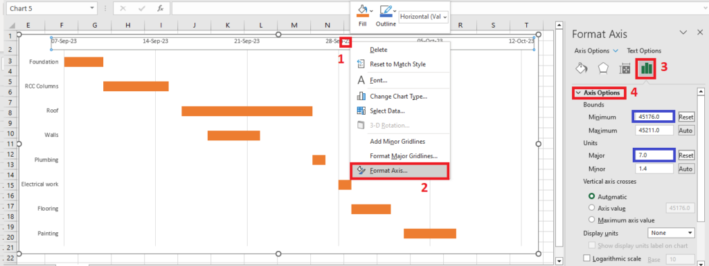
Adjust the number and density of the dates on the chart
1. To do this, Right-click on any date above the task bars on your chart and open the Format Axis dialog box.
2. Then, in the Axis Options window, increase the Major unit number to create more space between each date or decrease it to reduce the space between each date.
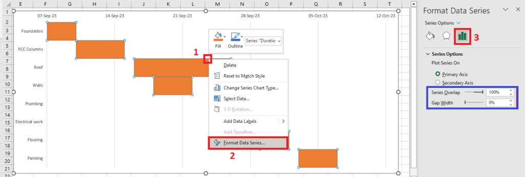
Remove excess white space between the bars
1. Select your bars by clicking on any of them, then right-click and select Format Data Series.
2. In the Format Data Series window that pops up, set the Series Overlap to 100% and the Gap Width to 0%.
Play with the chart design
Select the chart area, then click on Chart Design, then click on Add Chart Element > Chart Title > Above Chart.
In the Format Chart Title window, click on Title Options > Text Fill and select Solid fill. Then, select the color by clicking on the arrow pointing down next to the Color text.

And that’s pretty much it. You now know how to create a Gantt chart in Excel.
In case that’s too much work for you (we believe it might be) you can take the shortcut and use Excel Gantt chart templates.
Excel Gantt Chart Template Options
Microsoft Office comes with free and premium project timeline templates for making Excel Gantt charts.
Here are some you may find useful.
- Simple Gantt Chart Template: This is a free template that you can download from the official MS Office Templates website. However, this template does not have any options to add milestones.
- Agile Gantt Chart Template: A fully customizable, free template that agile teams can use to visualize their projects, track their tasks, and improve their workflows.
- Date Tracking Gantt Chart Template: This is a free template that allows you to simply track dates and milestones. Download it from the official MS Office Templates website.
Using these templates, you can somewhat simplify the process of creating a Gantt chart in Excel.
However, Excel templates come with certain limitations that only a more complex Gantt chart software tool can overcome.
Excel Gantt Chart Alternative
As you’ve seen, creating a Gantt chart in Excel is quite a task. And, it makes it almost impossible to collaborate with stakeholders and team members.
Plus, it’s hard to keep the Excel sheet up-to-date.
That’s where Toggl Plan can help.
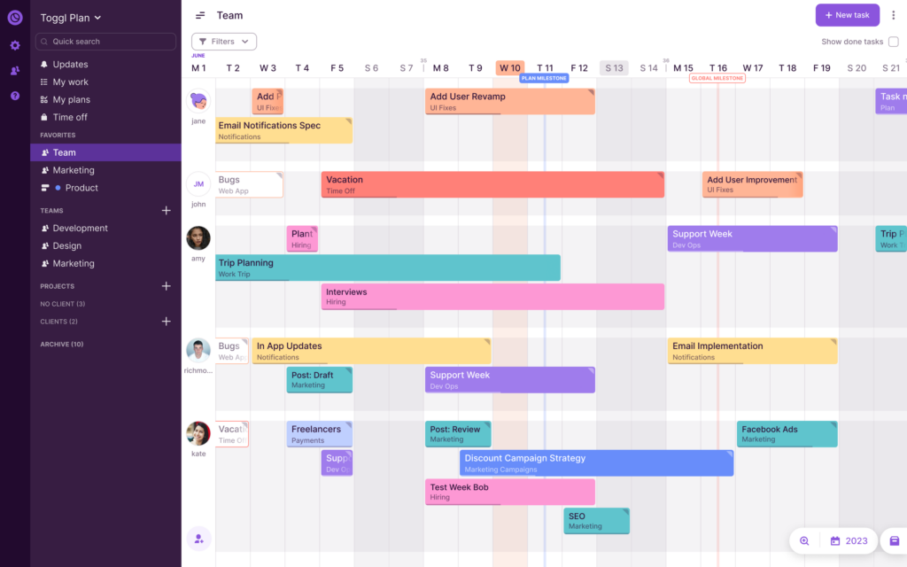
With Toggl Plan, you can:
- Create a Gantt chart timeline to plan and track a project’s schedule.
- Create a team timeline to manage resource availability and workloads.
- Add project milestones to manage project risk better.
- Collaborate with stakeholders. Add them to a timeline or share a read-only view.
- Assign tasks to multiple team members and track progress as they complete work.
Toggl Plan’s Gantt charts are easy to use. You can just click to add tasks on the timeline and move them around with a simple drag-and-drop.
Best of all, Toggl Plan is completely free for solo users. Teams can try our 14-day free trial. Paid plans are very affordable, starting at $9/user/month.
Frequently Asked Questions (FAQs)
What is a Gantt chart?
A Gantt chart is a visual representation of a project schedule and tasks. A Gantt chart provides a timeline view of project activities, with the start and finish dates of each task.
Is there a Gantt chart template in Excel?
Although Excel doesn’t have built-in Gantt chart templates, there are multiple free or paid templates that you can download from the official MS Office Templates website.
Are Gantt charts better than PERT charts?
Both Gantt charts and PERT charts are useful tools in project management, helping with project visualization and planning. However, they can serve different purposes and have distinct advantages, so it all comes down to the specific needs of each project.

Jitesh is an SEO and content specialist. He manages content projects at Toggl and loves sharing actionable tips to deliver projects profitably.